Will a Maximum Giveback Trail Improve Your Trading Outcomes?
Mike Smith
6/11/2025
•
0 min read
Share this post
Copy URL
You've been using a 30-pip trailing stop for as long as you can remember. It feels professional, manageable and relatively safe.
But during volatile sessions, you see your winners get stopped out prematurely, while low-volatility winners drift back and hit stops that are relatively too tight.
Same 30 pips, different market contexts, but inconsistent in the protection of profit and overall results.
The Fixed-Pip Fallacy?
Traders gravitate toward fixed pip trailing stops because they feel concrete and calculable. The approach is easy to execute, readily automated through platforms like MetaTrader, and aligns with how most people naturally think about profit and loss.
But this simplicity masks a fundamental problem.
A twenty-five pip move in EURUSD during the London open represents an entirely different market event than the same move during the Asian session. The context matters, yet the fixed-pip approach treats them identically.
This becomes even more problematic when you consider different currency pairs. GBPJPY might have an average true range of thirty pips on an hourly chart, while EURGBP shows only ten. The same trailing stop applied to both instruments ignores the reality that volatility varies dramatically across pairs.
Timeframe introduces yet another layer of complexity. Take AUDUSD as an example: a ten-pip move on a four-hour chart barely registers as meaningful price action, but on a five-minute chart it represents a significant swing. The fixed-pip method treats these scenarios as equivalent.
The natural response might be to use something more sophisticated, like an ATR multiple. This accounts for your chosen timeframe, the instrument's normal volatility, and even session differences. But it brings its own complications.
When do you measure the ATR? Do you use the value at entry, knowing it might be distorted by sessional effects? Or do you make it dynamic, which becomes far more complex to implement in practice?
Perhaps there's another way forward that doesn't rely on abstract measures of volatility but instead responds directly to the movement of price in relation to the trade you're actually in—accounting for your lot size and the profit you've already captured.
Maximum Give Back: The Percentage Approach
Instead of asking "how do I protect profit after fifty pips," ask "how do I protect profit after giving back a certain percentage of open gains."
Consider a maximum give-back threshold of 40%. When your trade is up one hundred pips, the trailing stop activates if price retraces forty pips from peak, locking in a minimum of sixty pips.
But when that same trade reaches two hundred fifty pips of profit, the stop adjusts, and now it activates at a one-hundred-pip pullback, securing at least one hundred fifty pips. The stop distance scales naturally with the magnitude of the win you're sitting on.
This creates a logical asymmetry that fixed pip approaches miss entirely. Small winners receive tighter protection. Big winners get room to breathe.
The approach adapts automatically to what the market is actually giving you in real time, without requiring you to predict anything in advance.
You don't need to maintain a reference table where EURUSD gets thirty pips and GBPJPY gets sixty. You don't need different standards for different instruments at all.
The same 40% logic works whether the average true range is high or low, whether volatility is expanding or contracting. It is designed to be more adaptive to regime changes than fixed-pip stops, potentially requiring less manual recalibration as it's responding to the trade itself rather than to abstract measures of what the instrument normally does.
The market tells you how much it's willing to move in your direction, and you protect that information proportionally. Nothing more complicated than that.
Key Parameters to Specify in Your System:
Maximum Give Back Percent: 30-50% is typical, but is dependent on how much profit retracement you can tolerate.
Minimum Profit to Activate: In dollar amount or an ATR multiple form entry. This prevents premature exits on tiny winners, e.g., if it has moved 5 pips at 40% that would mean you are only locking in a 3-pip profit.
Update Frequency: Potentially every bar. More frequent, but there may be issues if there is a limited ability to look at the market (if using some sort of automation, this could be programmed).
Is Maximum Giveback Always the Optimum Trail?
As with many approaches, results can be highly dependent on underlying market conditions. It is important to be balanced.
The table below summarises some observations when maximum giveback has been used as part of automated exits.
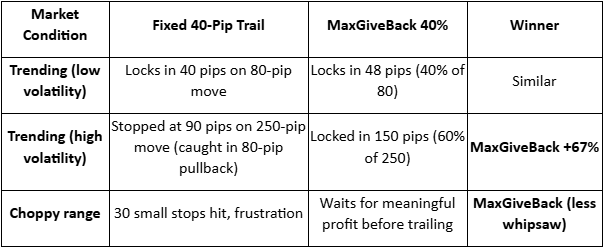
The major difference isn’t likely to be an increased win rate. It is about keeping more of your runners during high-volatility price moves rather than donating them back to the market.
It may not always be the best approach, as different strategies often merit different exit approaches.
There are two obvious scenarios where fixed pips may still be worth consideration.
Very short-term scalping (sub-20 pip targets)
News trading, where you want instant hard stops
Integrating Maximum Giveback With Your System
You may have other complementary exit filters in place that you already use. Remember, the ideal is often a combination of exits, with whichever is triggered first.
There is no reason why this approach will not work well with approaches such as set stops, take profits and partial closes (where you simply use maximum Giveback in the remainder as well as time-based exits.
Final Thoughts
To use fixed-pip trailing stops irrespective of instrument pricing, volatility, timeframe, and sessional considerations is the trading equivalent of wearing the same jacket in summer and winter.
Maximum Give Back trailing adjusts to the ‘market weather’. It won't make bad trades good, but it could help stop you from cutting your best trades short just because your stop was designed for average conditions.
The market doesn't trade in averages but has specific likely moves dependent on context. Your exits should not be average either.
By
Mike Smith
Mike Smith (MSc, PGdipEd)
Client Education and Training
The information provided is of general nature only and does not take into account your personal objectives, financial situations or needs. Before acting on any information provided, you should consider whether the information is suitable for you and your personal circumstances and if necessary, seek appropriate professional advice. All opinions, conclusions, forecasts or recommendations are reasonably held at the time of compilation but are subject to change without notice. Past performance is not an indication of future performance. Go Markets Pty Ltd, ABN 85 081 864 039, AFSL 254963 is a CFD issuer, and trading carries significant risks and is not suitable for everyone. You do not own or have any interest in the rights to the underlying assets. You should consider the appropriateness by reviewing our TMD, FSG, PDS and other CFD legal documents to ensure you understand the risks before you invest in CFDs. These documents are available here. Any references to Australian or international shares, sectors, indices, ETFs, crypto-related stocks or other instruments are provided for market commentary and watchlist purposes only and do not constitute a recommendation, offer or solicitation to buy, sell or hold any financial product or adopt any investment strategy. International markets may involve additional risks, including currency fluctuations, regulatory differences, market structure differences, reduced liquidity and higher volatility. Company-specific, sector-specific and macroeconomic risks may also affect performance.
Commentary on geopolitical developments, economic data, central bank decisions, earnings, policy changes and other global or financial market events is based on information available at the time of publication and may change without notice. Such events can lead to sudden market moves, price gaps, reduced liquidity, wider spreads and increased volatility, particularly in leveraged products such as CFDs. Forward-looking statements, expectations and scenario analysis are inherently uncertain and should not be relied on as guarantees of future market behaviour or outcomes.
Every time markets get jumpy, a three-letter acronym starts showing up in headlines and trading rooms. The VIX. You will see it called the fear gauge, the fear index, or just "vol." For newer traders, it can feel like an insider's number that everyone seems to track but few stop to explain.
Here is the part many new traders miss. The VIX is not a prediction of where the market will go. It is a reading of how much movement the market expects in the near future. That distinction sounds small. It changes how the number should be used.
This Playbook breaks the VIX down for beginner to light-intermediate traders. Part 1 explains what it is and how it works. Part 2 turns that understanding into a practical, scenario-based process you can use to prepare, observe, and manage risk.
Before you look for a setup
Understand how this market actually behaves first. Use this guide as a starting point, then practise the concepts on charts, watchlists, and demo tools before applying them in live conditions.
Part 01
The 101 explainer
Build a clear, foundational understanding before you do anything else.
The basics
What is the VIX, in plain English
The VIX is the Cboe Volatility Index. It is a real-time index designed to measure the expected volatility of the S&P 500 over the next 30 days. It is calculated from the prices of S&P 500 index options.
Here is a simpler way to picture it. Imagine the options market is a giant insurance market for stocks. When traders are worried, they pay more for protection. When they are calm, that protection gets cheaper. The VIX takes those insurance prices and turns them into a single number.
The VIX is not a measure of what has happened. It is a measure of what option markets expect to happen, in terms of magnitude, not direction.
The VIX does not tell you whether the S&P 500 will go up or down. It tells you how much movement is being priced in.
The VIX is not directly tradable as a stock. Traders gain exposure through related products such as VIX futures, VIX options, and volatility-linked exchange-traded products.
The VIX has spiked during every major market stress event
Approximate monthly closing levels of the Cboe Volatility Index, 2007 to 2024
Illustrative
Source: Stylised representation based on publicly reported Cboe VIX historical data (Cboe Global Markets). Selected month-end values are indicative only and intended for educational illustration. The VIX peak of approximately 82 during March 2020 and the GFC peak above 80 in late 2008 are widely reported. Past performance is not an indication of future performance.
Why It Matters
Why the VIX matters to new traders
Even if you never plan to trade volatility directly, the VIX still matters. It is one of the cleanest reads on market sentiment available, and it tends to move in ways that reflect risk appetite across global markets.
When the VIX rises sharply, it often coincides with falls in equity indices, wider spreads in many CFD markets, and a flight to perceived safer assets such as the US dollar, gold, or government bonds. When the VIX is low and stable, conditions often favour trending behaviour and tighter spreads.
For CFD traders, this matters because leverage can magnify both gains and losses. Volatility is the engine behind both. A market that moves more in a day can offer more opportunity, but it also raises the risk of fast adverse moves, gaps around news, and stop-outs in thin liquidity.
Vocabulary
The key terms to know
You do not need to memorise every piece of options jargon to use the VIX. These are the terms that come up most often.
Implied volatility
The market's expectation of how much an asset will move in the future, derived from option prices. The VIX is built from implied volatility.
Realised volatility
How much the market actually moved over a past period. Useful for comparing expectations against reality.
S&P 500
The benchmark index of around 500 large US companies. The VIX is calculated from options on this index.
Mean reversion
The tendency of a series to return to its long-term average over time. The VIX is widely described as mean-reverting.
Contango
The normal shape of the VIX futures curve, where longer-dated contracts trade higher than the spot VIX. Why it matters: cost can eat into returns over time.
Backwardation
When longer-dated VIX futures trade below spot. Often short and accompanies fast-moving markets where fear is concentrated now.
Risk-on and risk-off
Shorthand for periods when investors are willing to take more risk, or pull back from riskier assets. VIX rises during risk-off.
Spread
The difference between the bid and ask price. Spreads on many CFD markets can widen during high-volatility events.
Liquidity
How easily an asset can be bought or sold without affecting its price. Liquidity tends to thin out around major news, which can amplify moves.
Mechanics
How it works in real market conditions
The VIX is not pulled out of a single price. It is calculated continuously throughout the US trading session from a wide range of S&P 500 index option prices, weighted by how close they are to current levels and how far out their expiries are.
The VIX tends to move inversely to the S&P 500 most of the time. When equities fall, demand for downside protection often rises, which pushes implied volatility higher. The relationship is not mechanical. There are days when both rise or fall together.
The VIX also tends to spike harder than it falls. Volatility can rise quickly when stress hits the system, then ease more gradually as conditions normalise. Up the elevator, down the escalator.
VIX and the S&P 500 typically move in opposite directions
Stylised illustration of the inverse relationship over a 12-month window
Illustrative
Source: Stylised illustration based on publicly available Cboe VIX and S&P 500 (S&P Dow Jones Indices) historical relationships. The depicted inverse correlation is widely documented in academic and industry research, although the strength of the relationship varies across regimes. Educational purposes only.
Most of the time, the VIX sits below 20
Approximate share of daily closes by VIX range, indicative long-run distribution
Illustrative
Source: Stylised distribution based on publicly reported Cboe VIX historical data spanning multiple decades. Buckets and percentages are indicative and intended for educational illustration. Distributions can shift across volatility regimes.
K
Market IntelligenceDon’t trade the average. Track the split.
Use GO Markets charts, alerts and watchlists to monitor how the K-shaped consumer theme connects with the VIX.
With the Iran conflict reshaping energy markets, central banks turning hawkish, and gold in freefall despite the chaos, the safe haven playbook in 2026 is more complicated than ever.
Quick facts
Gold has fallen more than 20% from its all-time high, despite an active war in the Middle East
The Singapore dollar is near its strongest level against the USD since October 2014
The Reserve Bank of Australia (RBA) hiked rates to 4.10% in March 2026 as Iran-driven oil prices push Australian inflation higher
1. Gold (XAU/USD)
Gold remains the most widely traded safe haven globally. It benefits from geopolitical stress, US dollar weakness, and negative real interest rate environments. However, its short-term behaviour in 2026 demands explanation.
Despite an active war in the Middle East, gold has sold off sharply. The likely cause is the Fed trimming its 2026 rate cut projections, citing hotter-than-expected producer inflation and Strait of Hormuz-driven oil prices creating inflation persistence.
Ultimately, gold's bull case rests on falling real yields and a weaker dollar, and right now neither condition is in place. Traders should be aware that during an inflationary supply shock like the one the Iran conflict has delivered, gold does not always behave as expected.
However, if you zoom out, the longer-term picture reinforces gold’s safe-haven status, ending 2025 as one of its strongest years on record.
Key variables to watch: US Federal Reserve guidance, real yields, and USD direction.
2. Japanese Yen (JPY)
The yen has long functioned as a safe-haven currency thanks to Japan's status as the world's largest net creditor nation. In times of stress, Japanese investors tend to repatriate capital, driving the yen higher.
However, that dynamic seems to have shifted in 2026 so far. The yen is down 6.63% YoY, near its weakest level since July 2024, and surging oil import costs are weighing on the currency.
The yen's safe-haven role has not disappeared, though. It tends to reassert itself during sharp equity selloffs and liquidity events. But in an oil-driven inflation shock, it faces structural headwinds.
Key variables to watch: BOJ rate decisions, US-Japan yield differentials, and any intervention signals from Japanese authorities.
3. Swiss Franc (CHF)
Switzerland's political neutrality, account surplus, and strong institutional framework make the franc a reflexive safe-haven currency. Unlike the yen, the CHF is holding up in the current environment, with the franc gaining against the dollar in 2026, and EUR/CHF remaining stable.
For traders across Europe and the Middle East, CHF is often the first port of call during stress events.
Key variables to watch: Swiss National Bank intervention language, European geopolitical developments, and global risk indices.
4. US Treasury Bonds (US10Y)
Under normal conditions, US government bonds are some of the deepest, most liquid safe-haven instruments in the world. But 2026 is not normal conditions…
Yields have been rising, not falling, meaning bond prices are moving in the wrong direction for anyone seeking safety.
When yields rise during a risk-off event, it signals the market is treating bonds as an inflation risk rather than a safety asset.
However, short-duration Treasuries like bills and 2-year notes are a different story. They may offer higher income with less duration risk than longer-dated bonds, which is why some investors use them more defensively in volatile periods.
Key variables to watch: Fed communication, CPI and PCE data, and whether the 10Y yield breaks above 4.50% or pulls back below 4.00%.
5. Australian Dollar vs. US Dollar (AUD/USD): inverse play
The Australian dollar is widely considered a risk-on currency, tied closely to global commodity demand and Chinese growth.
In risk-off environments, AUD/USD typically falls. A falling AUD/USD can serve as a leading indicator of broader global stress, which can be useful context for traders with regional exposure.
The RBA hiking cycle (two hikes since the start of 2026) is providing some floor under the AUD, but in a sustained global risk-off move, that support has limits.
Key variables to watch: RBA forward guidance, Chinese PMI data, iron ore prices, and oil's impact on Australian inflation expectations.
6. US Dollar Index (DXY)
The US dollar acts as the world's reserve currency and a reflexive safe haven during acute stress. When liquidity dries up, global demand for USD tends to spike regardless of the underlying trend.
Over the past 12 months, the dollar has lost ground as global confidence in US fiscal trajectory has wavered. But over the past month, it has firmed, supported by a hawkish Fed and elevated geopolitical risk.
In risk-off environments, the USD continues to attract safe-haven flows. However, rising oil prices can increase inflation risks, complicating Federal Reserve policy expectations.
Key variables to watch: Fed rate path, US inflation data, and global liquidity conditions.
7. Singapore Dollar (SGD)
Less discussed globally but highly relevant across Southeast Asia, the SGD is one of the most quietly resilient currencies in the current environment.
The Singapore dollar has advanced to near its highest level since October 2014, supported by safe haven flows and investors drawn to Singapore's AAA-rated bonds, a dividend-heavy stock market, and predictable government policies.
The MAS manages the SGD through a nominal effective exchange rate band rather than an interest rate, giving it a different character from other safe-haven currencies.
For traders with exposure to Indonesia, Malaysia, Thailand, Vietnam, and the broader ASEAN region, USD/SGD can act as a practical benchmark for regional risk appetite.
Key variables to watch: MAS policy band adjustments, regional trade flows, and USD/Asia dynamics more broadly.
8. Cash and Short-Duration Fixed Income
Sometimes, the most effective safe haven can be to simply reduce exposure. With central bank rates still elevated across major economies, cash and short-duration government bonds can offer a meaningful yield while sitting outside market risk.
The RBA raised the cash rate to 4.10% at its March meeting. The Bank of England held at 3.75%, while the ECB kept its deposit facility rate at 2.00% and main refinancing rate at 2.15%.Across all major economies, short-duration government paper is offering a real return for the first time in years.
In a volatile environment, capital preservation can sometimes matter more than return maximisation.
Key variables to watch: Central bank meeting calendars across all major economies, and any shifts in forward guidance on the rate path.
What to Watch Next
Fed inflation data. Core PCE is the single most important data point for gold, bonds, and the dollar right now. Any surprise in either direction could move all three simultaneously.
Yen intervention risk. The yen is near levels that have previously triggered action from Japanese authorities. Traders with Asia-Pacific exposure should monitor closely.
RBA's next move. With Australia now at 4.10% and inflation still above target, the question is whether the hiking cycle has further to run. The next RBA meeting is on 5 May.
Geopolitical trajectory. Any move toward de-escalation in the Middle East would quickly reduce safe haven demand and rotate capital back into risk assets. The reverse is equally true.
China's growth signal. A stronger-than-expected Chinese recovery could lift commodity currencies and reduce defensive positioning across Asia-Pacific.
The Longer-Term Lens
The 2026 environment is exposing that the effectiveness of safe haven assets depends on the type of shock, not just its severity.
An inflationary supply shock like the Iran conflict has delivered is one of the most difficult environments for traditional safe havens.
Gold falls as real yields rise. Bonds sell off as inflation expectations climb. Even the yen can weaken as Japan's import costs surge.
What has held up are assets with institutional credibility, managed frameworks, and deep liquidity regardless of macro conditions. The Swiss franc, Singapore dollar, and short-duration cash instruments fit that description better than gold or long bonds do right now.
In 2026, the question for traders is not "which safe haven?" It is "a safe haven from what?"
If you've spent any time looking at a trading terminal, you've seen it. A news headline breaks, a chart line snaps, and suddenly everyone is rushing for the same exit or the same entrance. It looks like chaos. In practice, it is often a chain of mechanical responses.
This matters for a couple of reasons. Many readers assume the story is the trade. It is not. The story, whether it is an interest rate decision, a supply shock or an earnings miss, is the fuel and the playbook is the engine.
Below are seven core strategies often used in contracts for difference (CFDs) trading. With CFDs, you are not buying the underlying asset. You are speculating on the change in value. That means a trader can take a long position if the price rises, or a short position if it falls.
Seven strategies to understand first
1. Trend following (the establishment play)
Trend following works on the idea that a market already in motion can remain in motion until it meets a clear structural obstacle. Some market participants view it as a chart-based approach because it focuses on the prevailing direction rather than trying to call an exact turning point.
The rationale: The aim is to identify a clear directional bias, such as higher highs and higher lows, and follow that momentum rather than position against it.
What traders look for: Exponential moving averages (EMAs), such as the 50-day or 200-day EMA, are commonly used to interpret trend strength, though indicators can produce false signals and are not reliable on their own.
Source: GO Markets | Educational example only.
How it works: The 50-period EMA can act as a dynamic support level that rises as price rises. In an uptrend, some traders watch for the market to make a new higher high (HH), then pull back towards the EMA before moving higher again. Each higher low (HL) may suggest buyers are still in control.
When price touches or comes close to the 50-period EMA during that pullback, some traders treat that area as a potential decision zone rather than assuming the trend will resume automatically.
What to watch: The sequence of HHs and HLs is part of the structural evidence of a trend. If that sequence breaks, for example if price falls below the previous HL, the trend may be weakening and the setup may no longer hold.
2. Range trading (the ping-pong play)
Markets can spend long stretches moving sideways. That creates a range, where buyers and sellers are in temporary balance. Range trading is built around this behaviour, focusing on moves near the bottom and top of an established range.
The rationale: Price moves between a floor, known as support, and a ceiling, known as resistance. Moves near those boundaries can help define the width of the range.
What traders look for: Some traders use oscillators such as the Relative Strength Index (RSI) to help judge whether the asset looks overbought or oversold near each boundary.
Source: GO Markets | Educational example only.
How it works: The support level is a price zone where buying interest has historically been strong enough to stop the market from falling further. The resistance level is where selling pressure has historically prevented further gains.
When price approaches support, some traders look for signs of a potential rebound. When it approaches resistance, they look for signs that momentum may be fading. RSI readings below 35 can suggest the market is oversold near support, while readings above 65 can suggest it is overbought near resistance.
What to watch: The main risk in range trading is a breakout, when price pushes decisively through either level with strong momentum. This may signal the start of a new trend and using a stop-loss just outside the range on each trade may help manage that risk.
3. Breakouts (the coiled spring play)
Eventually, every range comes under pressure. A breakout happens when the balance shifts and price pushes through support or resistance. Markets alternate between periods of low volatility, where price moves sideways in a tight range, and high-volatility bursts where price can make a larger directional move.
The rationale: Quiet consolidation can sometimes be followed by a broader expansion in volatility. The tighter the compression, the more energy may be stored for the next move.
What traders look for: Bollinger Bands are often used to interpret changes in volatility. When the bands tighten, a squeeze is forming. Some market participants view a move outside the bands as a sign that conditions may be changing.
Source: GO Markets | Educational example only.
How it works: Bollinger Bands consist of a middle line, the 20-period moving average, and 2 outer bands that expand or contract based on recent price volatility. When the bands narrow and come close together, the squeeze, the market has been unusually calm.
This is often described as a coiled spring. Energy may be building, and a sharper move can follow. Some traders treat the first move through an outer band as an early clue on direction, rather than a definitive signal on its own.
What to watch: Not every squeeze leads to a powerful breakout. A false breakout occurs when price briefly moves outside a band, then quickly reverses back inside. Waiting for the candle to close outside the band, rather than entering mid-candle, can reduce the risk of being caught in a false move.
4. News trading (the deviation play)
This is event-driven trading. The focus is on the gap between what the market expected and what the data or headline actually delivered. Economic data releases, such as inflation figures (CPI), employment reports and central bank decisions, can cause sharp, fast moves in financial markets.
The rationale: High-impact releases, such as inflation data or central bank decisions, can force a fast repricing of assets. The bigger the surprise relative to expectations, the larger the move may be.
What traders look for: Traders often use an economic calendar to track timing. Some focus on how the market behaves after the initial reaction, rather than treating the first move as definitive.
Source: GO Markets | Educational example only.
How it works: Before the news, price may move in a calm, tight range as traders wait. When the data is released, if the actual reading differs significantly from the consensus expectation, repricing can happen fast.
Gold, for example, may spike sharply on a CPI reading that comes in above expectations. However, the candle can also print a very long upper wick, meaning price reached the spike high but was then rejected strongly. Sellers may step in quickly, and price may retrace. This spike-and-retrace pattern is one of the more recognisable setups in news trading.
What to watch: The direction and size of the initial spike do not always tell the full story. Wick length can offer an important clue. A long wick may suggest the initial move was rejected, while shorter wicks after a data release may indicate a more sustained directional move.
5. Mean reversion (the rubber-band play)
Prices can sometimes move too far, too fast. Mean reversion is built on the idea that an overextended move may drift back towards its historical average, like a rubber band pulled too tight, then snapping back.
The rationale: This is a contrarian approach. It looks for stretches of optimism or pessimism that may not be sustainable, and positions for a return to equilibrium.
What traders look for: A common example is price moving well away from a 20-day moving average (MA) while RSI also reaches an extreme reading. In that setup, traders watch for a move back towards the mean rather than a continuation away from it.
Source: GO Markets | Educational example only.
How it works: The 20-period MA represents the market's recent average price. When price moves into an extreme zone, such as more than 3 standard deviations above or below that average, it has moved a long way from its recent trend.
An RSI above 70 can suggest the market is stretched to the upside, while below 30 can suggest the same to the downside. Some mean reversion traders use these combined signals as a sign that a pullback towards the 20-period MA may be possible, rather than assuming the move will continue to extend.
What to watch: Mean reversion strategies can carry significant risk in strongly trending markets. A market can remain extended for longer than expected, and a position entered against the short-term trend can generate large drawdowns. Position sizing and clear stop-losses are critical.
6. Psychological levels (the big figure play)
Markets are driven by people, and people tend to focus on round numbers. US$100, US$2,000 or parity at 1.000 on a currency pair can act as magnets. In financial markets, certain price levels can attract a disproportionate amount of buying and selling activity, not because of technical analysis alone, but because of human psychology.
The rationale: Large orders, stop-losses and take-profit levels can cluster around these big figures, which may reinforce support or resistance. This self-reinforcing behaviour is one reason these rejections can become meaningful for traders.
What traders look for: Traders often watch how price behaves as it approaches a round number. The market may hesitate, reject the level or break through it with momentum. Multiple wick rejections at the same level may carry more weight than a single one.
Source: GO Markets | Educational example only.
How it works: When price approaches a round number from below, some traders watch for long upper wicks, the thin vertical line above the candle body. A long upper wick means price reached that level, but sellers stepped in aggressively and pushed it back down before the candle closed.
One wick rejection may be notable. Three in a cluster may be more significant. Some traders use this accumulated rejection as part of the case for a short (sell) setup at that level.
What to watch: Psychological levels can also act as magnets in the opposite direction. If price breaks through with conviction, the level may then act as support. A decisive close above the level, rather than just a wick break, can be an early sign that the rejection setup is no longer holding.
7. Sector rotation (the economic season play)
This is a macro strategy. As the economic backdrop changes, capital may move from higher-growth sectors into more defensive ones, and back again. Not all parts of the sharemarket move in the same direction at the same time.
The rationale: In a slowing economy, discretionary spending may weaken while demand for essential services can remain more stable. Investors may rotate capital between sectors accordingly.
What traders look for: With CFDs, some traders express this view through relative strength, taking exposure to a stronger sector while reducing or offsetting exposure to a weaker one.
Source: GO Markets | Educational example only.
How it works: During a growth phase, when the economy is expanding, investors tend to prefer growth-oriented sectors like technology. As the economic environment shifts, perhaps due to rising interest rates, slowing earnings or increasing recession risk, a rotation point may emerge.
In the slowdown phase, the pattern can reverse. Technology may weaken while utilities may strengthen, as investors move capital into defensive, income-generating sectors. Early signals can include relative underperformance in growth sectors combined with unusual strength in defensives.
What to watch: Sector rotation is not usually an overnight event. It typically unfolds over weeks to months. Tracking the ratio between two sectors, often shown in a relative strength chart, can make this shift visible before it becomes obvious in absolute price terms.
Why risk management is the engine of survival
The headline move is one thing. The market implication for your account is another. If you do not manage the mechanics, the strategy does not matter.
Because CFDs are traded on margin, a small market move may have an outsized impact on the account. If leverage is too high, even a minor wobble may trigger a margin call or automatic position closure, depending on the provider's terms. This is not a theoretical risk. It is a common reason new traders lose more than they expected on a trade that was directionally correct.
The market does not always move in a straight line. Sometimes, price gaps from one level to another, especially after a weekend or major news event and in those conditions, a stop-loss may not be filled at the exact requested price. That is known as slippage. It is one reason large positions may carry additional risk into major announcements.
Bottom line
The vehicle is powerful, but the playbook is what helps keep you on the road.
The obvious trade is often already priced in. What matters more is understanding which market condition is in front of you. Is it trending, ranging, breaking out or simply reacting to a headline?
Readers assessing leveraged products often focus on position sizing, risk limits and product disclosure before deciding whether the product is appropriate for them. The headlines will keep changing. The maths of risk management does not.
Disclaimer: This article is general information only and is intended for educational purposes. It explains common trading concepts and market behaviours and does not constitute financial product advice, a recommendation, or a trading signal. Any examples are illustrative only and do not take into account your objectives, financial situation or needs. CFDs are complex, leveraged products that carry a high level of risk. Before acting, consider the PDS and TMD and whether trading CFDs is appropriate for you. Seek independent advice if needed. Past performance is not a reliable indicator of future results.
If you have ever wondered why a forex pair moves sharply on a single Tuesday afternoon, the answer often sits inside one number: the cash rate.
On 5 May 2026, the Reserve Bank of Australia (RBA) raised its cash rate target by 25 basis points (bps) to 4.35%. The decision unwound much of the easing cycle traders had spent the previous year debating. Markets repriced quickly, and the Australian dollar moved against major peers as traders digested the decision.
When one rate decision changes the market mood
For new traders, decisions like this can feel chaotic.
The chart moves before the headline finishes loading. Spreads widen. Stop levels can be tested in seconds. The financial media then fills with confident takes that often disagree with one another.
This playbook is designed to help you make sense of that chaos. Not by predicting the next move, but by understanding how the cash rate works, how it can ripple through markets, and how to prepare a process before the next decision lands.
Important
This article is general market commentary and education only. It does not constitute personal financial advice. Trading CFDs carries significant risk and may not be suitable for everyone.
Part 01
The 101 explainer
Build a clear, foundational understanding before going anywhere near a setup.
The Basics
What the cash rate is, in plain English
The cash rate is the interest rate that commercial banks charge each other for overnight, unsecured loans. The cash rate target is the level a central bank officially sets to steer that market.
In Australia, the RBA sets the cash rate target to manage inflation and employment. While the names vary, each acts as an anchor for the following equivalents:
United States: Federal Funds Rate
United Kingdom: Bank Rate
Eurozone: Main Refinancing Rate
New Zealand: Official Cash Rate
A simple way to think about it is as the wholesale price of money. When that wholesale price rises, the retail prices linked to it, such as mortgage rates, business loans, savings rates and bond yields, often move higher too. When it falls, borrowing costs across the economy tend to ease.
For traders, this is the macro anchor. It is not just a number on an economic calendar; it influences currencies, indices, commodities, and yield-sensitive stocks.
Where the world's major policy rates sit in May 2026
Headline cash rate equivalents at major central banks, expressed in per cent.
Illustrative
Source. Reserve Bank of Australia, US Federal Reserve, Bank of England, European Central Bank, Bank of Japan and Reserve Bank of New Zealand official statements, figures as at May 2026. Educational illustration.
Why It Matters
Why the cash rate matters more than new traders expect
Central bank decisions are among the most closely watched events on the market calendar. That is because one rate decision can influence several markets at once, from currencies and bond yields to share indices, commodities and the cost of holding leveraged positions overnight.
It affects more than currencies
For CFD traders, this matters for two main reasons. First, leverage can magnify both gains and losses when markets are volatile. Around a central bank decision, price can move quickly, spreads can widen and risk controls become especially important.
It can change holding costs
Second, the swap or holding cost on a CFD position is linked to the underlying cash rate. When rates change, the cost of carrying a position overnight may also change. For example, a pair like AUD/JPY can behave differently when the yield gap between Australia and Japan is wide compared with when it is narrow.
Markets can reprice quickly
New traders often underestimate how fast markets can react. A central bank can shift expectations with one sentence in a statement or press conference.
Markets do not wait for the next quarterly review. They often adjust as soon as the message changes.
Vocabulary
The key terms to know
You do not need to memorise every term in this list. These are the ones that come up most often around cash rate decisions.
Cash rate target
The interest rate level set by a central bank to anchor the economy.
Basis points (bps)
1bp = 0.01%. A 25bps move is a 0.25% change in rates.
Repricing
Markets adjusting expectations instantly after new info.
Hawkish vs Dovish: Hawkish leans toward higher rates (supports currency); Dovish leans toward lower rates (weighs on currency).
Yield Differential: The rate gap between two economies that drives capital flows.
Carry trade
Investing in high-yield via low-yield borrowing.
Risk-on/off
Market mood favouring growth vs safe-havens.
Trimmed Mean
Inflation measure that filters out volatile price swings.
Swap or Rollover:
The overnight interest charge/credit for leveraged positions.
Watch for triple swaps on Wednesdays which account for weekend settlement.
Position Sizing
What a 25 bps move may cost you
Basis points can sound abstract until you connect them to position size. Here is a simplified way to show why a small percentage move can matter for a CFD trader. A standard one-lot position in major FX is 100,000 units of the base currency and a 25 bps shift in the underlying cash rate is 0.25% per year.
The point is not the exact cents. It is that small-sounding percentage changes can compound on leveraged positions held for weeks or months.
Position size
Annual exposure to a 25 bps shift
Approximate daily impact
Standard lot, 100,000 units
About 250 units
About 0.68 units
Mini lot, 10,000 units
About 25 units
About 0.07 units
Micro lot, 1,000 units
About 2.50 units
About 0.01 units
Note. Figures are illustrative and shown in the quote currency of the pair. Educational illustration only.
How it works in real market conditions
A central bank decision is rarely just about the rate change itself. The market reaction is shaped by three layers: the decision, the statement, and any press conference or projections.
On 5 May 2026, the RBA raised the cash rate to 4.35%. While the hike was the headline, the statement and subsequent press conference provided the context that allowed markets to reprice bond yields and currency pairs in real time.
AUD/USD often spikes, fades, then trends after a rate decision
Stylised intraday reaction in the first 90 minutes around a hawkish RBA surprise.
Illustrative
Source. Stylised illustration based on typical post-decision price behaviour. Educational purposes only. Liquidity can shift quickly: In the first 5 to 15 minutes after a decision, spreads can widen and fills can slip. High-frequency systems can digest language faster than humans, and mean reversion is common before a clearer trend emerges.
Market Dynamics
How central banks ripple across assets
Cash rate decisions rarely affect one market in isolation. They trigger a domino effect through currencies, yields, and volatility at varying speeds.
This kind of sector dispersion is not just an equities story. The same monetary tightening can produce sharply different outcomes across consumer segments, business sizes and parts of the wider economy, a dynamic sometimes called a K-shaped economy.
Major FX pairs
AUD/USD, EUR/USD, and JPY crosses respond directly to yield differentials.
Short-end yields
The 2-year government bond often acts as a leading indicator for currency moves.
Stock indices
High rates discount future earnings, weighing heavily on growth and tech names.
Gold & safe havens
Bullion reacts to real yields and the USD; hawkish shifts usually pressure gold prices.
Energy markets
Prices feed into inflation expectations, creating a feedback loop for central bank policy.
Market dispersion
When index components move in opposite directions following a rate change.
A tightening cycle can split the ASX 200
Illustrative
Stylised illustration of sector dispersion through a tightening cycle, with index levels rebased to 100.
Source. Stylised illustration based on typical sector behaviour during tightening cycles. Outcomes vary by cycle. Educational purposes only.
The Beginner Trap
What many new traders miss
Markets react to the gap between expectations and reality. A hike that is fully priced in can lead to a falling currency; a hold with hawkish guidance can trigger a rally. The chart is only one part of the story. The setup may look simple, but the risk rarely is.
"Success in these events comes from understanding what is already priced in, and what would change the view if it does not play out that way."
Common mistakes to avoid
• Trading headlines: The initial print is often misleading. Wait for the second wave (statement/press conference).
• Binary leverage: Volatility hits stops harder. Scale risk down into known event risks.
• Chasing moves: Entering late usually means buying exhaustion. Wait for clear retracements.
• Narrative vs. trade: A clear story doesn't guarantee a setup. Ask: "What is already in the price?"
• Indicator myopia: No single signal captures global flows. Watch yields and cross-asset confirmation.
• No Invalidation: Without a clear "I am wrong" level, traders hold losing positions far too long.
Next Strategic Step
Master the volatility cycle
Understanding how the cash rate moves the market is only half the battle. Learn how to read the "Fear Gauge" to identify when volatility creates high-probability entry points.
Every time markets get jumpy, a three-letter acronym starts showing up in headlines and trading rooms. The VIX. You will see it called the fear gauge, the fear index, or just "vol." For newer traders, it can feel like an insider's number that everyone seems to track but few stop to explain.
Here is the part many new traders miss. The VIX is not a prediction of where the market will go. It is a reading of how much movement the market expects in the near future. That distinction sounds small. It changes how the number should be used.
This Playbook breaks the VIX down for beginner to light-intermediate traders. Part 1 explains what it is and how it works. Part 2 turns that understanding into a practical, scenario-based process you can use to prepare, observe, and manage risk.
Before you look for a setup
Understand how this market actually behaves first. Use this guide as a starting point, then practise the concepts on charts, watchlists, and demo tools before applying them in live conditions.
Part 01
The 101 explainer
Build a clear, foundational understanding before you do anything else.
The basics
What is the VIX, in plain English
The VIX is the Cboe Volatility Index. It is a real-time index designed to measure the expected volatility of the S&P 500 over the next 30 days. It is calculated from the prices of S&P 500 index options.
Here is a simpler way to picture it. Imagine the options market is a giant insurance market for stocks. When traders are worried, they pay more for protection. When they are calm, that protection gets cheaper. The VIX takes those insurance prices and turns them into a single number.
The VIX is not a measure of what has happened. It is a measure of what option markets expect to happen, in terms of magnitude, not direction.
The VIX does not tell you whether the S&P 500 will go up or down. It tells you how much movement is being priced in.
The VIX is not directly tradable as a stock. Traders gain exposure through related products such as VIX futures, VIX options, and volatility-linked exchange-traded products.
The VIX has spiked during every major market stress event
Approximate monthly closing levels of the Cboe Volatility Index, 2007 to 2024
Illustrative
Source: Stylised representation based on publicly reported Cboe VIX historical data (Cboe Global Markets). Selected month-end values are indicative only and intended for educational illustration. The VIX peak of approximately 82 during March 2020 and the GFC peak above 80 in late 2008 are widely reported. Past performance is not an indication of future performance.
Why It Matters
Why the VIX matters to new traders
Even if you never plan to trade volatility directly, the VIX still matters. It is one of the cleanest reads on market sentiment available, and it tends to move in ways that reflect risk appetite across global markets.
When the VIX rises sharply, it often coincides with falls in equity indices, wider spreads in many CFD markets, and a flight to perceived safer assets such as the US dollar, gold, or government bonds. When the VIX is low and stable, conditions often favour trending behaviour and tighter spreads.
For CFD traders, this matters because leverage can magnify both gains and losses. Volatility is the engine behind both. A market that moves more in a day can offer more opportunity, but it also raises the risk of fast adverse moves, gaps around news, and stop-outs in thin liquidity.
Vocabulary
The key terms to know
You do not need to memorise every piece of options jargon to use the VIX. These are the terms that come up most often.
Implied volatility
The market's expectation of how much an asset will move in the future, derived from option prices. The VIX is built from implied volatility.
Realised volatility
How much the market actually moved over a past period. Useful for comparing expectations against reality.
S&P 500
The benchmark index of around 500 large US companies. The VIX is calculated from options on this index.
Mean reversion
The tendency of a series to return to its long-term average over time. The VIX is widely described as mean-reverting.
Contango
The normal shape of the VIX futures curve, where longer-dated contracts trade higher than the spot VIX. Why it matters: cost can eat into returns over time.
Backwardation
When longer-dated VIX futures trade below spot. Often short and accompanies fast-moving markets where fear is concentrated now.
Risk-on and risk-off
Shorthand for periods when investors are willing to take more risk, or pull back from riskier assets. VIX rises during risk-off.
Spread
The difference between the bid and ask price. Spreads on many CFD markets can widen during high-volatility events.
Liquidity
How easily an asset can be bought or sold without affecting its price. Liquidity tends to thin out around major news, which can amplify moves.
Mechanics
How it works in real market conditions
The VIX is not pulled out of a single price. It is calculated continuously throughout the US trading session from a wide range of S&P 500 index option prices, weighted by how close they are to current levels and how far out their expiries are.
The VIX tends to move inversely to the S&P 500 most of the time. When equities fall, demand for downside protection often rises, which pushes implied volatility higher. The relationship is not mechanical. There are days when both rise or fall together.
The VIX also tends to spike harder than it falls. Volatility can rise quickly when stress hits the system, then ease more gradually as conditions normalise. Up the elevator, down the escalator.
VIX and the S&P 500 typically move in opposite directions
Stylised illustration of the inverse relationship over a 12-month window
Illustrative
Source: Stylised illustration based on publicly available Cboe VIX and S&P 500 (S&P Dow Jones Indices) historical relationships. The depicted inverse correlation is widely documented in academic and industry research, although the strength of the relationship varies across regimes. Educational purposes only.
Most of the time, the VIX sits below 20
Approximate share of daily closes by VIX range, indicative long-run distribution
Illustrative
Source: Stylised distribution based on publicly reported Cboe VIX historical data spanning multiple decades. Buckets and percentages are indicative and intended for educational illustration. Distributions can shift across volatility regimes.
K
Market IntelligenceDon’t trade the average. Track the split.
Use GO Markets charts, alerts and watchlists to monitor how the K-shaped consumer theme connects with the VIX.