


Australian inflation, Japan data and China PMI as regional catalysts | Asia-Pacific outlook
Mike Smith
27/1/2026
•
0 min read
Share this post
Copy URL
Asia-Pacific markets head into the week with Australia’s CPI as the key domestic catalyst, Japan’s month-end inflation and activity data keeping JPY and equities in focus, and China’s official PMI providing an important read on regional growth momentum.
Quick facts
China: NBS manufacturing PMI rose to 50.1 in December 2025. Consensus for Saturday’s release is 50.2.
Australia: CPI, Australia (Dec) is the key local catalyst, with implications for rate expectations and AUD pricing.
Japan: Tokyo CPI and month-end labour/activity data keep USD/JPY and Nikkei futures in focus following last week’s BoJ meeting.
Global backdrop: US earnings momentum, US CPI expectations and geopolitical developments remain secondary but relevant drivers for Asia-Pacific risk sentiment.
China
Attention turns to China’s official PMI after December’s improvement saw the PMI move back above 50—a level commonly interpreted as expansion in the survey, though month-to-month readings can be volatile.
Consensus suggests a rise to 50.2; if met, it may help reinforce the view that growth momentum is stabilising into early 2026.
Key release
Sat 31 Jan: NBS manufacturing and non-manufacturing PMI (Jan)
How markets may respond
Regional equities and risk: Sustained PMI readings above 50 could support broader Asia risk appetite and materials-linked sectors. A reversal below 50 may temper recent optimism.
AUD spillover: China-sensitive assets, including the AUD and materials stocks on the ASX, may react alongside domestic CPI outcomes.
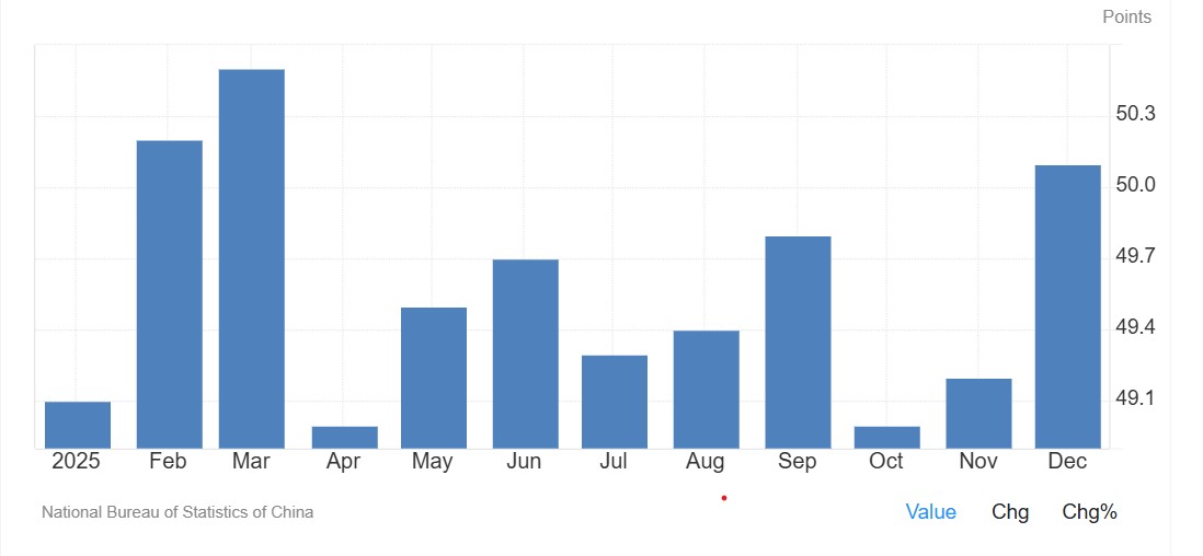
China PMI
Japan
Following last week’s BoJ meeting, focus shifts to Tokyo CPI and month-end activity data. These releases late in the week may shape near-term expectations around Japan’s inflation trajectory and the tone of the dataflow.
Key events
Thu 29 Jan: Tokyo CPI (Jan) (medium sensitivity)
Fri 30 Jan: Japan unemployment (Dec), retail sales (Dec), industrial production (Dec) (medium sensitivity)
How markets may respond
USD/JPY: Month-end inflation and activity data can drive front-end rate repricing, with USD/JPY remaining a key transmission channel.
JP225 (Nikkei futures): The contract has recently traded in a defined range. Market participants may monitor the ~54,250 area on the upside and ~52,250 on the downside as reference points, with price action around these levels often used to gauge whether the range is persisting.
Australia’s week is dominated by the CPI release. The outcome may influence rate expectations, with the next scheduled RBA decision still in the balance.
ASX 30 Day Interbank Cash Rate Futures imply around a 56% probability of a cash-rate increase at the next scheduled RBA decision (implied pricing can change quickly and is not a forecast).
AUD pricing is likely to remain sensitive alongside broader global risk conditions.
Key release
Wed 28 Jan: CPI, Australia (Dec) (high sensitivity)
How markets may respond
ASX 200: Rate-sensitive sectors may react more to the policy implications than the headline CPI number, particularly given recent strength in materials.
AUD/USD: CPI outcomes may influence whether AUD/USD sustains around/above its current zone or drifts back toward prior trading ranges.
Mike Smith (MSc, PGdipEd)
Client Education and Training
Disclaimer: Articles are from GO Markets analysts and contributors and are based on their independent analysis or personal experiences. Views, opinions or trading styles expressed are their own, and should not be taken as either representative of or shared by GO Markets. Advice, if any, is of a ‘general’ nature and not based on your personal objectives, financial situation or needs. Consider how appropriate the advice, if any, is to your objectives, financial situation and needs, before acting on the advice. If the advice relates to acquiring a particular financial product, you should obtain our Disclosure Statement (DS) and other legal documents available on our website for that product before making any decisions.

Markets enter May with the federal funds target range at 3.50% to 3.75%, the Fed having concluded its 28-29 April meeting, and the next decision not due until 16-17 June. Brent crude is trading near US$108 per barrel, with the IEA describing the ongoing Iran conflict as the largest energy supply shock on record as the Strait of Hormuz remains effectively closed.
The macro tension this month is straightforward but uncomfortable: an oil-driven inflation impulse landing into a labour market that surprised to the upside in March, while Q1 growth came in soft.
The Federal Reserve has revised its 2026 PCE inflation projection to 2.7% and continues to signal one cut this year, though the timing remains contested. With no FOMC scheduled in May, every high-impact release may carry more weight than usual into the June meeting.
Fed Funds Rate
3.50% to 3.75%
Next FOMC
16-17 June 2026
Brent Crude
~US$108
Key data events
6+ high-impact releases
Growth: business activity and demand
The growth picture entering May is mixed. The Q1 GDP advance estimate landed on 30 April, while softer retail sales and inventory data have made the demand picture harder to read.
ISM manufacturing has been a quieter source of optimism, with recent prints holding in expansionary territory. Energy costs and tariff effects are now the variables most likely to shape the next move in business activity.
Key dates (AEST)
02
May
ISM Manufacturing PMI (April)
Institute for Supply Management · 12:00 am AEST
High
06
May
ISM Services PMI (April)
Institute for Supply Management · 12:00 am AEST
Medium
15
May
Retail Sales (April)
US Census Bureau · 10:30 pm AEST
High
What markets look for
Whether manufacturing PMI holds above 50, with the prices paid sub-index giving a read on input cost pressure
Services PMI as a check on the larger share of the US economy, particularly employment and prices
Retail sales control group, which feeds into consumption forecasts
Any sign that sustained Brent crude above US$100 is starting to affect household spending
How this data may move markets
Scenario
Treasuries
USD
Equities
Activity data prints firmer
↑ Yields rise
↑ Firmer
Mixed - depends on valuation stretch
Activity data softens
↓ Yields fall
↓ Softer
Support if inflation cooperates
Labour: payrolls and employment data
The April Employment Situation is one of the most concentrated risk events of the month. March payrolls came in stronger than expected, while earlier data revisions left the trend less clear. April will help show whether the labour market is genuinely re-accelerating or simply absorbing seasonal noise.
Key dates (AEST)
06
May
Job Openings and Labor Turnover Survey (JOLTS)
Bureau of Labor Statistics · 12:00 am AEST
Medium
06
May
ADP National Employment Report (April)
ADP Research Institute · 10:15 pm AEST
Medium
08
May
Employment Situation, April (NFP)
Bureau of Labor Statistics · 10:30 pm AEST
High
What markets may watch
Headline non-farm payrolls (NFP) and the size of any prior-month revisions
Average hourly earnings, with energy-driven cost pressure keeping wage growth in focus
Unemployment rate and labour force participation
Sector mix, including whether goods-producing payrolls show signs of disruption
Market sensitivities
Scenario
Treasuries
USD
Equities
Firm NFP/wage growth
↑ Yields rise
↑ Strength
Pressure on valuations
Soft NFP/weak print
↓ Yields fall
↓ Softer
Mixed - risk of growth scare
Inflation: CPI, PPI and PCE
April inflation lands as the most market-relevant data block of the month. The March consumer price index (CPI) rose 3.3% over the prior 12 months, with energy up 10.9% on the month and gasoline up 21.2%, accounting for almost three quarters of the headline increase. With Brent holding near US$105 to US$108 through the latter half of April, a further passthrough into the April CPI energy component looks plausible.
Core CPI and core personal consumption expenditures (PCE) remain the better read on underlying trend.
Key dates (AEST)
12
May
CPI (April)
Bureau of Labor Statistics · 10:30 pm AEST
High
15
May
Producer Price Index (PPI), April
Bureau of Labor Statistics · 10:30 pm AEST
Medium
29
May
Personal Income and Outlays/PCE (April)
Bureau of Economic Analysis · 10:30 pm AEST
High
What markets may watch
Headline CPI year on year, especially the gasoline component
Core CPI, including shelter, services excluding shelter and core goods
PPI as a read on producer-level passthrough from energy and tariffs
Core PCE, which remains the Fed’s preferred inflation gauge
Market sensitivities
Scenario
Treasuries
USD
Commodities
Inflation cools/surprises lower
↓ Yields fall
↓ Softer
Gold consolidation
Headline runs hot/core sticky
↑ Yields rise
↑ Strength
Gold supported on stagflation risk
Policy, trade and earnings
May has no FOMC meeting, so policy attention shifts to Fed speakers, the path of any leadership transition, and the dominant geopolitical backdrop. Chair Jerome Powell's term concludes around the middle of the month. President Donald Trump has nominated Kevin Warsh as the next Fed chair, with the Senate Banking Committee having held a confirmation hearing.
The Iran conflict, now in its ninth week, remains the single largest source of macro tail risk, with the Strait of Hormuz blockade and stalled US-Iran talks setting the tone for energy markets and broader risk appetite. Q1 earnings season is in its peak weeks, with peak weeks expected between 27 April and 15 May, and 7 May the most active reporting day.
What to monitor this month
Iran-US negotiations and the operational status of the Strait of Hormuz
Fed speakers and any change in tone between meetings
Q1 earnings, especially from retail, energy and cyclical names
Weekly EIA crude inventories
Any tariff-related announcements that may affect inflation expectations
Bottom line
May is not a quiet month just because there is no FOMC meeting. Payrolls, CPI, PPI, retail sales and PCE all land before the June policy decision, while oil remains the dominant external shock.
For markets, the key question is whether the data points to a temporary energy-driven inflation lift, or a broader inflation problem arriving at the same time as softer growth. That distinction may shape the next major move in bonds, the US dollar, gold and equity indices.
Here is the situation as April begins. A war is affecting one of the world's most important oil chokepoints. Brent crude is trading above US$100. And the Federal Reserve (Fed), which spent much of 2025 engineering a soft landing, is now facing an inflation threat driven less by wages, services or the domestic economy, and more by energy. It is watching an oil shock.
The Fed funds rate sits at 3.50% to 3.75%. The next Federal Open Market Committee (FOMC) meeting is on 28 and 29 April and the key question for markets is not whether the Fed will cut, it is whether the Fed can cut, or whether the energy shock may have shut that door for much of 2026.
A heavy run of major data releases lands in April. The March consumer price index (CPI), non-farm payrolls (NFP) and the advance estimate of Q1 gross domestic product (GDP) are the three that matter most. But the FOMC statement on 29 April may be the release that sets the tone for the rest of the year.
Fed Funds Rate
3.50%–3.75%
Next FOMC
28–29 April 2026
Brent crude
Above US$100
Key data events
12 major releases
Growth: Business activity and demand
Think about what the US economy looked like coming into this year: AI-driven capital expenditure (capex) was a major part of the growth narrative, corporate investment intentions looked firm and the One, Big, Beautiful Bill Act was already in the mix. On paper, the growth story looked solid.
Then the Strait of Hormuz situation changed the calculus. Not because the US is a net energy importer, it is not, and that structural insulation matters. But what is good for US energy producers can still squeeze margins elsewhere and weigh on global demand. The 30 April advance Q1 gross domestic product (GDP) estimate is now likely to be read through two lenses: how strong was the economy before the shock, and what it may signal about the quarters ahead.
Key dates (AEST)
2
Apr
US international trade in goods and services (February)
Bureau of Economic Analysis · 10:30 pm AEDT
Medium
30
Apr
Q1 GDP — advance estimate
Bureau of Economic Analysis · 10:30 pm AEST
High
What markets look for
Resilience in Q1 GDP despite the elevated interest rate environment and early energy cost pressures
Trade balance movements linked to shifting global tariff frameworks
Business investment intentions following passage of the "One Big Beautiful Bill Act"
Early signs of capacity constraints emerging in technology-heavy sectors
How this data may move markets
Scenario
Treasuries
USD
Equities
Stronger than expected growth
↑ Yields rise
↑ Firmer
Mixed - depends on inflation read
Softer growth/GDP miss
↓ Yields fall
↓ Softer
Risk off if stagflation narrative builds
Labour: Payrolls and employment
February's jobs report was, depending on how you read it, either a blip or a warning sign. Non-farm payrolls (NFP) fell by 92,000, unemployment edged up to 4.4% and the official line was that weather played a role. That may be true but here is what also happened. The labour market suddenly looked a little less convincing as the main argument for keeping rates elevated.
The 3 April employment report for March is now genuinely consequential. A bounce back to positive payroll growth would probably steady nerves and a second consecutive soft print, particularly against a backdrop of higher energy prices, would start to build a very uncomfortable narrative for the Fed. It would be looking at slower jobs growth and an inflation threat at the same time. That is not a comfortable place to be.
Key dates (AEST)
3
Apr
March employment situation (NFP and unemployment rate)
Bureau of Labor Statistics · 10:30 pm AEDT
High
30
Apr
Q1 employment cost index
Bureau of Labor Statistics · 10:30 pm AEST
Medium
What markets look for
A return to positive payroll growth, or confirmation that February's softness was the start of a trend
Stabilisation or further movement in the unemployment rate from 4.4%
Average hourly earnings growth relative to core inflation — the wage-price dynamic the Fed watches closely
Weekly initial jobless claims as a real-time signal of whether layoff activity is rising
Inflation: CPI, PPI and PCE
Here is the uncomfortable truth about where inflation sits right now. Core personal consumption expenditures (PCE), the Fed's preferred gauge, was already running at 3.1% year on year in January, before any oil shock had fed through. The Fed had not fully solved its inflation problem, rather, it had slowed it down. That is a different thing.
And now, on top of a not-quite-solved inflation problem, oil prices have moved sharply higher. Energy prices can feed into the consumer price index (CPI) relatively quickly, through petrol, transport and logistics costs that can eventually show up in the price of nearly everything. The 10 April CPI print for March is probably the most important single data release of the month, it is the one that may tell us whether the energy shock is already showing up in the numbers the Fed watches.
Key dates (AEST)
10
Apr
Consumer price index (CPI) — March
Bureau of Labor Statistics · 10:30 pm AEST
High
14
Apr
Producer price index (PPI) — March
Bureau of Labor Statistics · 10:30 pm AEST
Medium
30
Apr
Personal income and outlays incl. PCE price index — March
Bureau of Economic Analysis · 10:30 pm AEST
High
What markets look for
Monthly CPI acceleration driven by energy and shelter components — the two stickiest inputs
PPI as a forward-looking signal: producer cost pressure tends to feed into consumer prices with a lag
PCE trends relative to the Fed's 2% target, particularly the core reading that strips out food and energy
Any sign that AI-related pricing power is feeding into corporate margins in ways that sustain elevated core readings
How this data may move markets
Scenario
Treasuries
USD
Gold
Cooling core inflation
↓ Yields fall
↓ Softer
↑ Supportive
Sticky or rising inflation
↑ Yields rise
↑ Firmer
↓ Headwind
Policy, trade and earnings
April is also the start of US earnings season, and this quarter's results carry an unusual amount of weight. Investors have been pouring capital into AI infrastructure on the basis that returns are coming. The question is when. With geopolitical volatility driving a rotation away from growth-oriented technology and towards energy and defence, JPMorgan Chase's 14 April earnings will be read as much for what management says about the macro environment as for the numbers themselves.
Then there is the FOMC meeting on 28 and 29 April. After the early-April run of data, including NFP, CPI and producer price index (PPI), the Fed will have more than enough information to update its language. Whether it signals that rate cuts could remain on hold through 2026, or whether it leaves the door slightly ajar, may be the most consequential communication of the quarter.
Geopolitical volatility has already pushed investors to reassess growth-heavy positioning. The estimated US$650 billion AI infrastructure buildout is also coming under heavier scrutiny on return on investment. If earnings season disappoints on that front, and if the FOMC signals a prolonged hold, the combination could test risk appetite heading into May.
Monitor this month (AEST)
◆
14 April - JPMorgan Chase Q1 earnings
The first major bank to report. Management commentary on credit conditions, consumer spending, and the macro outlook will set the tone for financial sector earnings and broader market sentiment.
◆
15 April - Bank of America Q1 earnings
A read on consumer credit conditions and household financial health, particularly relevant given rising energy costs and the 4.4% unemployment rate.
◆
28-29 April - FOMC meeting and policy statement
The month's most consequential event. The statement and any updated forward guidance may effectively confirm whether rate cuts remain a possibility for 2026.
◆
Ongoing - Strait of Hormuz tanker traffic
A live indicator of energy supply risk. Any escalation or resolution carries immediate implications for oil prices, inflation expectations, and the Fed's options.
◆
Ongoing - Sovereign AI export restrictions
Developing policy around technology export curbs may affect capital expenditure plans for US technology firms, with knock-on implications for growth and employment in the sector.
The Bigger Picture
Geopolitical volatility has forced a rotation into energy and defence at the expense of growth oriented technology positions. The estimated US$650 billion AI infrastructure buildout is increasingly being scrutinised for returns on investment. If earnings season disappoints on that front, and if the FOMC signals a prolonged hold, the combination could test risk appetite heading into May.
Asia-Pacific markets start April with a focus on how prolonged disruption in the Strait of Hormuz feeds through to inflation, trade flows, and policy expectations. China's 15th Five-Year Plan shifts attention toward artificial intelligence and technological self-reliance, with knock-on effects for supply chains and regional growth. Japan and Australia both face the challenge of managing imported energy inflation while gauging how far they can normalise policy without derailing domestic demand.
For traders, the mix of elevated energy prices and policy divergence may keep volatility elevated across regional indices and currencies.
Key watchlist
Top China data point
March exports (14 April)
Top Japan event
BOJ rate decision (27-28 April)
Top Australia event
March quarter CPI (29 April)
Main regional wildcard
Sovereign AI trade restrictions
Most sensitive market
Nikkei 225 / USD/JPY
Key threshold
Brent crude above US$110
China
Lawmakers in Beijing have approved the 15th Five-Year Plan (2026-2030), placing artificial intelligence (AI) and technological self-reliance at the centre of the national agenda. The government has set a growth target of 4.5% to 5.0% for 2026, the lowest in decades, as it prioritises quality of growth over speed.
APAC Sections — GO Markets (Webflow embed snippets)
Key dates (AEST)
13
Apr
M2 money supply and new yuan loans
People's Bank of China
Medium
14
Apr
March balance of trade
General Administration of Customs
High
16
Apr
Q1 GDP and March industrial production
National Bureau of Statistics
High
What markets look for
Evidence of technology-driven industrial production growth consistent with Five-Year Plan priorities
March export resilience in the face of shifting global tariff frameworks
Signs of stabilisation in domestic consumer retail sales
Any implementation detail on the "new-type national system" for AI development
Why it matters for the region
China's shift toward high-value manufacturing and AI self-sufficiency could reshape regional supply chains and influence demand for commodities. A stronger-than-expected trade surplus may support broader regional sentiment, although higher energy costs can pressure margins for Chinese exporters and weigh on import demand. The 16 April GDP release carries the most weight as the first quarterly read on whether the 4.5%-5.0% target is tracking.
Japan
The Bank of Japan (BOJ) faces increasing pressure to normalise policy as energy-driven inflation risks a resurgence. While consumer prices excluding fresh food slowed to 1.6% in February, the recent oil price spike may push the consumer price index (CPI) back toward the 2% target in coming months.
Key dates (local / AEDT or AEST)
30
Mar
Tokyo CPI (March)
Statistics Bureau of Japan · Lead indicator for national trends (AEDT)
Medium
27–28
Apr
BOJ monetary policy meeting and outlook report
Bank of Japan · Live event for rate hike watch (AEST)
High
What markets look for
BOJ guidance on the timing of potential rate increases
March Tokyo CPI data as a lead indicator for national price trends
Updated inflation forecasts in the quarterly outlook report
Official comments on yen volatility and any reference to intervention thresholds
Why it matters
The BOJ remains a global outlier, with its short-term policy rate held at 0.75% after the March meeting, and any hawkish shift could trigger sharp moves in forex pairs involving the yen. Markets are weighing whether the BOJ can tighten policy while the government simultaneously resumes energy subsidies to shield households from rising oil costs. These competing pressures make the April meeting and outlook report unusually informative.
Australia
The Australian economy remains in a state of two-speed divergence, with older households increasing spending while younger cohorts face significant affordability pressures. Following the Reserve Bank of Australia's (RBA) rate increase to 4.10% in March, markets are highly focused on upcoming inflation data to assess whether additional tightening may be required.
Key dates (AEST)
16
Apr
March unemployment rate
Australian Bureau of Statistics · 11:30 am AEST
Medium
29
Apr
March quarter CPI (Q1)
Australian Bureau of Statistics · 11:30 am AEST
High
30
Apr
March producer price index (PPI)
Australian Bureau of Statistics · 11:30 am AEST
Medium
What markets look for
Whether Q1 underlying inflation remains above the RBA's 2%-3% target band
Labour market resilience in the face of rising borrowing costs
The pass-through of global energy prices into domestic transport and logistics costs
RBA minutes (31 March) for any signal of internal policy disagreement
Why it matters
The 29 April CPI release may be the most consequential domestic data point before the RBA's May meeting. If inflation proves sticky or accelerates due to global energy shocks, the probability of a further rate increase could rise, with implications for both the Australian dollar and volatility across the ASX 200. The PPI reading the following day may also provide early signal on whether producer-level cost pressures are building in the pipeline.
Regional themes
◆
ASEAN demand signals
March trade data from Singapore and Malaysia may indicate whether regional electronics demand is holding up amid global uncertainty.
◆
India growth trajectory
Elevated energy costs could weigh on India's 2026 expansion plans, particularly following the New Delhi AI summit and associated infrastructure commitments.
◆
Commodity sentiment
Iron ore and thermal coal prices remain sensitive to signals from China's industrial policy and the pace at which Five-Year Plan priorities translate into actual demand.
◆
Currency pressure
Energy-importing economies across Asia and Europe may face sustained currency headwinds if Brent crude holds above US$100 for an extended period.
Track Asia-Pacific themes and monitor moves as they unfold. Open an account · Log in
Every time markets get jumpy, a three-letter acronym starts showing up in headlines and trading rooms. The VIX. You will see it called the fear gauge, the fear index, or just "vol." For newer traders, it can feel like an insider's number that everyone seems to track but few stop to explain.
Here is the part many new traders miss. The VIX is not a prediction of where the market will go. It is a reading of how much movement the market expects in the near future. That distinction sounds small. It changes how the number should be used.
This Playbook breaks the VIX down for beginner to light-intermediate traders. Part 1 explains what it is and how it works. Part 2 turns that understanding into a practical, scenario-based process you can use to prepare, observe, and manage risk.
Before you look for a setup
Understand how this market actually behaves first. Use this guide as a starting point, then practise the concepts on charts, watchlists, and demo tools before applying them in live conditions.
Part 01
The 101 explainer
Build a clear, foundational understanding before you do anything else.
The basics
What is the VIX, in plain English
The VIX is the Cboe Volatility Index. It is a real-time index designed to measure the expected volatility of the S&P 500 over the next 30 days. It is calculated from the prices of S&P 500 index options.
Here is a simpler way to picture it. Imagine the options market is a giant insurance market for stocks. When traders are worried, they pay more for protection. When they are calm, that protection gets cheaper. The VIX takes those insurance prices and turns them into a single number.
The VIX is not a measure of what has happened. It is a measure of what option markets expect to happen, in terms of magnitude, not direction.
The VIX does not tell you whether the S&P 500 will go up or down. It tells you how much movement is being priced in.
The VIX is not directly tradable as a stock. Traders gain exposure through related products such as VIX futures, VIX options, and volatility-linked exchange-traded products.
The VIX has spiked during every major market stress event
Approximate monthly closing levels of the Cboe Volatility Index, 2007 to 2024
Illustrative
Source: Stylised representation based on publicly reported Cboe VIX historical data (Cboe Global Markets). Selected month-end values are indicative only and intended for educational illustration. The VIX peak of approximately 82 during March 2020 and the GFC peak above 80 in late 2008 are widely reported. Past performance is not an indication of future performance.
Why It Matters
Why the VIX matters to new traders
Even if you never plan to trade volatility directly, the VIX still matters. It is one of the cleanest reads on market sentiment available, and it tends to move in ways that reflect risk appetite across global markets.
When the VIX rises sharply, it often coincides with falls in equity indices, wider spreads in many CFD markets, and a flight to perceived safer assets such as the US dollar, gold, or government bonds. When the VIX is low and stable, conditions often favour trending behaviour and tighter spreads.
For CFD traders, this matters because leverage can magnify both gains and losses. Volatility is the engine behind both. A market that moves more in a day can offer more opportunity, but it also raises the risk of fast adverse moves, gaps around news, and stop-outs in thin liquidity.
Vocabulary
The key terms to know
You do not need to memorise every piece of options jargon to use the VIX. These are the terms that come up most often.
Implied volatility
The market's expectation of how much an asset will move in the future, derived from option prices. The VIX is built from implied volatility.
Realised volatility
How much the market actually moved over a past period. Useful for comparing expectations against reality.
S&P 500
The benchmark index of around 500 large US companies. The VIX is calculated from options on this index.
Mean reversion
The tendency of a series to return to its long-term average over time. The VIX is widely described as mean-reverting.
Contango
The normal shape of the VIX futures curve, where longer-dated contracts trade higher than the spot VIX. Why it matters: cost can eat into returns over time.
Backwardation
When longer-dated VIX futures trade below spot. Often short and accompanies fast-moving markets where fear is concentrated now.
Risk-on and risk-off
Shorthand for periods when investors are willing to take more risk, or pull back from riskier assets. VIX rises during risk-off.
Spread
The difference between the bid and ask price. Spreads on many CFD markets can widen during high-volatility events.
Liquidity
How easily an asset can be bought or sold without affecting its price. Liquidity tends to thin out around major news, which can amplify moves.
Mechanics
How it works in real market conditions
The VIX is not pulled out of a single price. It is calculated continuously throughout the US trading session from a wide range of S&P 500 index option prices, weighted by how close they are to current levels and how far out their expiries are.
The VIX tends to move inversely to the S&P 500 most of the time. When equities fall, demand for downside protection often rises, which pushes implied volatility higher. The relationship is not mechanical. There are days when both rise or fall together.
The VIX also tends to spike harder than it falls. Volatility can rise quickly when stress hits the system, then ease more gradually as conditions normalise. Up the elevator, down the escalator.
VIX and the S&P 500 typically move in opposite directions
Stylised illustration of the inverse relationship over a 12-month window
Illustrative
Source: Stylised illustration based on publicly available Cboe VIX and S&P 500 (S&P Dow Jones Indices) historical relationships. The depicted inverse correlation is widely documented in academic and industry research, although the strength of the relationship varies across regimes. Educational purposes only.
Most of the time, the VIX sits below 20
Approximate share of daily closes by VIX range, indicative long-run distribution
Illustrative
Source: Stylised distribution based on publicly reported Cboe VIX historical data spanning multiple decades. Buckets and percentages are indicative and intended for educational illustration. Distributions can shift across volatility regimes.
K
Market IntelligenceDon’t trade the average. Track the split.
Use GO Markets charts, alerts and watchlists to monitor how the K-shaped consumer theme connects with the VIX.
The “resilient consumer” line being recycled across earnings calls is doing a lot of work. Index-level data helps it along. Headline retail sales hold. Spending looks firm. Stop reading there and the story looks simple.
But it is not.
Underneath sits a split-screen economy, the K-shape, where one consumer is carried by asset wealth, US large-cap exposure and the AI rally, while another is stuck with the less glamorous arithmetic of petrol, credit card minimums and a car loan that gets harder to service with each statement.
For CFD traders, the average is the problem. What matters is which side of the K a stock, sector or currency pair is exposed to, because that is where margins, earnings guidance, single-stock CFDs, index performance, commodities and FX may start telling a more divided story.
The big "K"
The "K" is just a chart shape. One arm angles up. The other angles down. Apply that shape to households and you get a workable model of who is benefiting from the current cycle, and who is being squeezed by it.
The upper arm, where asset wealth is doing the heavy liftingCONTINUE READING
The upper arm is asset-rich. These households own homes, hold the bulk of equity exposure and have benefited from the AI-linked rally in US large-cap equities. Net worth has been rising faster than inflation, which means their spending may be less price-sensitive and less reliant on borrowing. Roughly 87 per cent of all US equities sit with the top 10 per cent of households and that concentration matters when markets rally, because the wealth effect lands in fewer pockets than people assume.
The K-shaped consumer
One economy, two very different households
Upper arm
Wealth is still growing
+28%
US equity wealth, 12 months
Growth: Big Tech and AI stocks have helped wealth grow
Spending: Higher earners are still spending freely
Demand: Luxury and travel demand remain strong
Lower arm
Budgets are under pressure
2010
Auto loan stress near post-GFC highs
Prices: Much higher than levels seen in 2021
Credit: Card stress is rising across households
Timing: Pressure builds before headline data updates
Bull case Rate cuts may give some relief
Caution Stress could weaken broader spending
Disclaimer: This graphic is for general informational purposes only and presents scenario-based commentary, not financial advice or a recommendation to buy, sell or hold any security or financial product. References to equity wealth growth, auto-loan stress, household credit conditions and consumer spending are based on available Federal Reserve and New York Fed data as at May 2026 and may be revised. Historical comparisons and market performance, including AI-related equity gains, are not reliable indicators of future outcomes. Actual consumer, market and economic conditions may differ materially from those implied by the “Bull Case” or “Caution” scenarios.
The lower arm, where pressure shows up first
The lower arm tells a different story. With official US inflation still around 3.7 per cent, lower-income earners are spending more on essentials and falling back on credit. Auto loan delinquencies have climbed to their highest level since 2010.
That is not a recession signal on its own. It is a strain signal. And because strain rarely stays neatly contained, it can start to show up in the spending mix before it shows up in the headline data.
The clue markets cannot ignore
The punchline is this: the top 20 per cent of US earners now account for more than 60 per cent of total retail spend. Once you internalise that, a lot of consumer-stock charts start to make more sense.
USD IN FOCUS
Manage your catalysts
Prepare for upcoming events and review your approach before trading.
The split is not new, after all markets have seen versions of this before, because every few cycles, the same uncomfortable pattern comes back into view: one part of the consumer economy keeps moving, while another starts to drag.
Continue reading
Same K-shape,
faster upper arm
The K-shape is not new. What is different in 2026 is the speed and concentration of the upper arm. AI-linked equity wealth has supercharged the asset-rich consumer faster than in any earlier dispersion cycles.
~35%
~40%
~43%
~49%
01 · Dot-com Era
First sustained dispersion
Top 5 per cent income growth ran 4.1 per cent a year. Equity ownership began to concentrate significantly, marking the first modern iteration of the split.
02 · Post-GFC
Highly concentrated recovery
Around 95 per cent of recovery gains went to the top 1 per cent. The bottom 80 per cent of wealth holders lost 39 per cent. Stocks rebounded aggressively while housing remained stagnant.
03 · COVID Rebound
The Stimulus Buffer
Stimulus briefly narrowed the K-shape. However, the subsequent equity surge saw the top 10 per cent capture roughly 90 per cent of all corporate equity gains.
04 · AI-Led Cycle
Accelerated Verticality
The top 10 per cent now drives about 49 per cent of total consumer spending—the highest share since 1989. AI-linked equities have structurally accelerated the upper arm at record speed.
Sources: Moody’s Analytics review of Federal Reserve data via Bloomberg, Sept 2025. Pew Research Center. IMF Finance & Development. Federal Reserve FEDS Notes.
Why the K-shape matters for CFDs
Aggregate data, such as headline retail sales, total consumer credit and broad index moves, averages everyone together. In a single-consumer economy, that average is useful but in a K-shaped economy, the average can mislead. What matters is which side of the K a company sits on and whether the price reflects that.
How the K reaches your screen
Step 01
Customer mix splits
Upper and lower arms spend differently.
➔
Step 02
Earnings diverge
Margins, guidance, and credit profiles split.
➔
Step 03
CFDs reprice
Where the trader sees the move on platform.
A simplified transmission view. Real-world price moves reflect many overlapping macroeconomic drivers.
Continue reading
That changes the way three things behave.
1. Dispersion: Two stocks in the same sector can post very different earnings depending on who their customer is. An index move can mask that. A single-stock CFD does not. A luxury retailer and a value retailer may both sit inside the consumer universe, but they are not trading the same household balance sheet. A premium travel name and a budget operator may both report on travel demand, but the customer mix can make the earnings story very different.
For traders, the sector label is only the first layer. The customer base is the second.
2. Margin pressure: Companies serving the lower arm may be increasingly forced to discount. PepsiCo, for example, has cut prices on certain snack lines by around 15 per cent. Margin compression at the bottom often does not show up in headline beats. It can show up later in guidance.
That is where CFD traders need to be careful with the first read. A company can beat revenue expectations and still guide cautiously if it had to protect volume with promotions, price cuts or weaker margins.
3. Credit signals: Big banks publish their own K-shaped commentary every quarter. JPMorgan’s recent quarterly update flagged that higher-income borrowers are holding up while lower-income cohorts are showing more strain in credit card charge-offs. JPMorgan reported managed revenue of US$50.5 billion in its most recent quarter. The headline is one thing. The K-shaped colour commentary inside the release is another.
That kind of language has, in past cycles, preceded a wider repricing of consumer-facing names. It does not guarantee one this time.
CFD sector examples
One way to analyse the K-consumer theme is to compare companies in pairs rather than looking only at single names. This is not about deciding which stock is good or bad. It is an illustrative way to compare how different customer bases may influence market commentary and price behaviour.
Source attribution and disclaimer: Data and examples are drawn from S&P Global Market Intelligence, Federal Reserve Distributional Financial Accounts, ASX company announcements, RBA household credit data, PepsiCo’s February 2026 strategic update and Wesfarmers’ 2026 half-year results. Companies are categorised by their primary revenue-generating demographic based on recent annual reporting. The “CFD Trader’s Watchlist” is provided for general information and educational commentary only. Company names are used to illustrate the “K-shaped consumer” theme and are not financial advice, a recommendation, or a solicitation to buy, sell or hold any security, CFD, derivative or other financial product.
How the split reaches APAC screens
For Australian CFD traders, the K-consumer theme can reach local screens through three channels the US names alone do not capture:
1. Direct ASX read-throughs
The APAC tab in the watchlist maps the K onto Australian consumer names. Wesfarmers does most of the heavy lifting, because Kmart and Bunnings sit on opposite arms of the same business. Endeavour and Coles play discretionary against defensive in staples. Flight Centre and Webjet do the same in travel. Macquarie and Latitude split the credit story.
2. The China-luxury feedback loop
The upper arm is not only a US story. LVMH, Hermès and Richemont sit downstream of the high-end Chinese consumer. A softer luxury read in Asia can move broader risk appetite, mining sentiment and AUD/USD before it shows up in US data, which is why luxury can be an early signal.
3. AUD/USD as the macro carrier
A stretched US lower arm may push the Federal Reserve toward a more dovish stance. That could pressure the US dollar and support AUD/USD, depending on commodity sentiment and the RBA. The K-consumer story is not always a retail story. Sometimes it shows up in FX first.
Forward outlook
How the theme could play out
Base
Bank charge-off rates and discretionary retailer guidance start to confirm or unwind the dispersion narrative.
Upside
AI-linked equity gains keep feeding the wealth effect at the top end.
Downside
The next consumer credit report shows further deterioration in lower-income cohorts.
Watch list
Fed commentary on financial conditions, US consumer credit prints, bank earnings language and ASX consumer names.
Base
The K persists into mid-year, with broad indices continuing to mask it.
Upside
Rate cuts begin lifting both arms unevenly, with rate-sensitive, lower-income households getting some relief.
Downside
A sustained Brent move above US$120 pressures mid-tier discretionary spend and forces earnings downgrades.
Watch list
Fed dot plot revisions, oil supply shocks, retailer guidance, China luxury demand, AUD/USD and mining sentiment.
Scenario disclaimer: The “Next 30 days” and “Next 3 months” scenarios are illustrative “what-if” models for stress-testing a market thesis and identifying potential catalysts. They are not a house view, forecast, guarantee, or prediction of future market movement. Any Brent price targets, Fed policy references, or other market benchmarks are hypothetical only.
Continue Reading
Failure paths
Where the framework could break
Upper-arm reversal
If the AI rally rolls over, upper-arm spending could weaken faster than the data has suggested.
China factor
Luxury demand can weaken if China's high-end consumer slows.
Energy reversal
If energy prices fall rather than spike, the lower-arm squeeze eases and the dispersion trade unwinds.
AUD/USD divergence
AUD/USD can move against expectations if commodity prices fall or the RBA deviates from global policy paths.
Already priced in
By the time a theme is widely discussed, much of the move may already be priced into the instruments.
Execution
CFDs are leveraged. Wider dispersion can mean larger gap risk around earnings and tighter conditions for stop placement.
General information only. Scenarios are illustrative. Real-world conditions are subject to volatility and unforeseen shifts.
The bottom line
The K is not a forecast. It is a lens. It forces the question headline data ignores: whose consumer am I actually trading?
For CFD traders, answering that can be the difference between an index move and a single-stock CFD that tells the opposite story.
The next test is threefold:
Earnings: Does upper-arm demand hold as luxury and tech reports land?
Energy: Does Brent stay contained below US$90, or does a spike further squeeze the lower-arm budget?
Credit: Does bank commentary continue to flag the income split JPMorgan called out this quarter?
The work is not to predict the break. It is to decide your response before it happens. By the time the headline lands, the price, and the opportunity, may have already moved.
Next week: Tesla, AI infrastructure and how the same dispersion logic plays out one layer up the stack.
Make your next move count
Stay sharp with watchlists, charts and alerts as conditions change.
This afternoon, the Reserve Bank of Australia (RBA) did what plenty of forecasters had pencilled in, but few quite believed would actually arrive. It lifted the official cash rate by another 25 basis points (bps) to 4.35 per cent.
Across the water in Tokyo, the Bank of Japan (BOJ) is still sitting at 0.75 per cent, with Governor Ueda fielding three dissenting board members and asking everyone to be patient.
That leaves the interest rate gap between Sydney and Tokyo at 360 bps, the widest it has been in this cycle. And that gap is not just an economic footnote. It is the fuel behind one of the world’s most popular, and most accident-prone, trades in currency markets: the Yen carry trade.
This is where the story gets interesting.
Quick refresher: what is a carry trade?
A carry trade is when investors borrow money in a country with very low interest rates and park it in a country with higher ones. The Japanese yen has been the world’s favourite borrowing currency for years, mostly because Japanese rates were pinned near zero for a generation.
Borrow yen at 0.75 per cent, buy Australian dollars yielding 4.35 per cent, and investors may collect the difference. When the AUD is stable or rising, the trade can look wonderfully simple. When it turns, it can become brutally complicated.
That is the mechanism and now... to put it on a chart.
Policy rate paths: RBA vs BOJ (Nov 2025 to May 2026)
RBA cash rateBOJ policy rate
The RBA has resumed hiking while the BOJ has held since January, leaving the gap between the two cash rates at its widest point of the current cycle. This divergence remains a fundamental driver for AUD/JPY carry trade dynamics.
You can see why traders are paying attention. The green line keeps stepping up. The dashed line has gone flat since January. That fan-out is the story in one picture.
But the chart only tells half of it. The other half is why these two central banks have ended up in such different places.
Two banks, two different problems
The RBA is not raising rates because the economy is humming along, rather, it is raising them because petrol has crossed 240 cents a litre and Governor Bullock has decided imported energy inflation cannot be ignored.
The BOJ, meanwhile, would dearly like to hike to defend a yen flirting with the 160 mark against the US dollar. The problem is that it is also wary of upsetting a Nikkei 225 sitting near record highs around 60,000.
So the BOJ waits, the RBA acts, and AUD/JPY becomes one of the cleaner expressions of the gap.
The headline divergence is one thing. The carry now on offer is where things start to bite.
RBA minus BOJ rate spread (basis points)
Rate SpreadCycle High
The carry available to a long AUD, short JPY position has widened by 50 basis points in six months. This structural divergence creates one of the most significant yield-seeking opportunities in G10 currency pairs heading into mid-2026.
A 50 bps widening in six months is not small. It changes how attractive the trade looks on a yield basis. More importantly, it changes how many traders may be sitting in the same position.
And crowded trades have a habit of looking calm right up until they do not.
Why the CFD angle matters
This is not just a macro story sitting on a central bank noticeboard. It can show up directly in the prices on a CFD trader’s screen, and it may change how several common instruments behave at once.
Start with leverage. Contracts for difference (CFDs) amplify both sides of a wider rate gap: the slow grind higher and the sudden snap lower.
Then there is overnight financing, which broadly reflects the rate differential between the two currencies. With the gap now at 360 bps, a long AUD/JPY position may have positive overnight financing, while a short position may pay it. That does not make long AUD/JPY the right trade. It simply means the cost profile has changed.
The divergence also radiates outward. Nikkei 225 CFDs can ride the weak-yen tailwind, but may take a hit if the Yen strengthens on intervention chatter. Gold CFDs can also catch a bid when carry positions unwind. USD/JPY around 160 is the chart the Ministry of Finance is likely to care about, and a break there could pull the yen higher against more than just the dollar.
That is the honest summary: a widening rate gap does not hand CFD traders a trade. It hands them a regime where the opportunity looks bigger, but so does the trapdoor.
Manage your catalysts
Prepare for upcoming events and review your approach before trading.
The immediate base case is fairly tame. AUD/JPY could drift higher as traders price the wider gap and the Australian dollar finds support from today’s hike. An upside acceleration could come from softer yen positioning and steady risk appetite.
However, tame does not mean safe. A rate check by Japan’s Ministry of Finance, often the warning shot before actual currency intervention, could trigger a sharp yen rally and force carry positions to unwind.
Short-term Watchlist
USD/JPY behaviour around 160
MoF intervention commentary
Australian petrol prices
Heading into 16 June: Double Decision Day
The headline event is 16 June, when the RBA and BOJ deliver decisions on the same day. While the most likely outcome is a “no surprise” hold from both, markets rarely wait politely.
An upside scenario for AUD/JPY would be a hot Australian inflation print on 27 May that supports a hawkish RBA posture. Conversely, any shift in BOJ language towards earlier normalisation could compress the spread quickly. Margin settings can also vary around major events, making the calendar a key influence on trade behaviour.
The Upside Trigger
A hot Australian inflation print on 27 May supports a hawkish RBA posture.
The Fade Risk
A shift in BOJ language towards earlier normalisation narrows the spread.
The August Outlook
By August, the picture may look different. If oil cools and Australian inflation softens, the 4.35 per cent rate may turn out to be the cycle peak. The base case from there is a slow narrowing of the gap as the BOJ inches higher.
The uglier path is a global growth scare that lifts the yen as a safe haven, forcing positions to unwind regardless of interest rate maths. This is the uncomfortable truth: the maths can look tidy, but the exits can get messy.
The psychological trap to watch for
Rate divergence stories feel mathematically clean. The numbers can suggest a currency should appreciate, traders pile in, and the chart obliges. Then one intervention headline lands, the move reverses in 20 minutes, and stops are hit at the worst available price.
The bias to watch is carry complacency, the assumption that because the trade has worked for months, it will keep working. That is usually when the market becomes least forgiving.
A risk question for traders is simple: if this pair moved 3 per cent in the wrong direction overnight, would the position size still be reasonable? If the answer is no, that may say more about sizing than the trade view.
Bottom line
What traders may want on the radar: watchlists that reflect the divergence, broker swap rates and margin policies, and a clear view on what level of volatility they are prepared to sit through.
Though the carry story has momentum, it also has a tripwire and the next move may depend on which one markets notice first.
Watching Asia-Pacific moves today?
Track Asia-Pacific themes and monitor moves as they unfold with our institutional-grade tools.