- Trading
- Trading
- Markets
- Markets
- Accounts
- Accounts
- Platforms & tools
- Platforms & tools
- Platforms
- Platforms
- Premium trading tools
- Premium trading tools
- Education
- Education
- Resources
- Resources
- Help & support
- Help & support
- About
- About
- Client support
- Trading
- Trading
- Markets
- Markets
- Accounts
- Accounts
- Platforms & tools
- Platforms & tools
- Platforms
- Platforms
- Premium trading tools
- Premium trading tools
- Education
- Education
- Resources
- Resources
- Help & support
- Help & support
- About
- About
- Client support
 News & Analysis
The MACD – Useful indicator or just another pretty picture?
3 November 2019The MACD (or the ‘Moving Average Convergence/Divergence oscillator’ to give its full name) is one of the popular extra pieces of information we often see added to charts. The purpose of this article is to clarify what it may be telling you about market sentiment and offer a description as to how traders commonly apply this in their decision making.
This is a slightly lengthier article; brief explanation may not be clear, and we want you to really get to grips with this so you can make the right decisions for you.
Taking a step back.
The purpose of technical indicators is to provide the trader with information to assist in entry, or exit, decision making.
We have discussed the choice of adding indicators previously and suggested the following:
a. You should not add an indicator unless you understand what it is telling you about market sentiment.
b. You should only use any indicator if it provides additional information to that which you have already. To do so may create a more colourful and impressive looking chart but little else.
c. You should always articulate how you are going to use an indicator for entry and/or exit in your trading plan in a specific unambiguous statement to facilitate consistency and measurement.
d. There is no point on adding extra indicators if you are not sufficiently disciplined to use the existing plan you have. There is a different priority here you may need to work on if this resonates with you!In this article we are hoping to add some value in addressing “a” through to “c”.
What could the MACD be telling you?
The MACD was developed in the 1970’s with the aim of offering information about changes in trend and momentum of a price move. Additionally, there is a signal line that could assist in pressing the entry/exit button.
Despite the somewhat complicated and jargon -filled full version of its title (hence the abbreviation), which unfortunately may put off some inexperienced traders from finding out more before they jump in and blindly use it, when you pick it apart, it is not perhaps as complicated as it may first seem.
The indictor is based as the name suggests on using the commonly used and more easily understood moving averages and the principle that if you plot two of these on a chart of different periods e.g. 10 and 20, a cross of these may indicate a change in trend.
Before we move on to looking at the MACD on the MetaTrader platform, it is worth noting that those traders with experience of other software will notice a difference in how the MACD is shown. We will be discussing the MT4/5 version of this indicator as that is the platform that most of you will be using.
Before we look at the indicator itself let’s look at a simple chart with two moving averages plotted and explain some of the terms to help explain some of the terminology once we move to the indicator itself.
Here we see a GBPUSD 15-minute chart. There are two exponential moving averages (EMA) namely a 12 and 26 (the reason for this will become obvious in a moment.
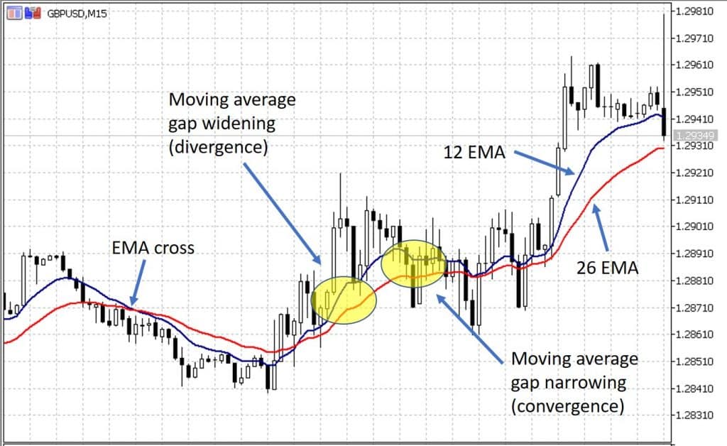
We see a moving average cross marked; in this case the 26 EMA has moved above the shorter 12 EMA often perceived as indicating a change in trend to the downside.
We also see highlighted in yellow, firstly an example where the moving averages are moving further apart (termed divergence), this is often seen as a signal of increasing momentum as a trend develops.Subsequently, we see highlighted the space between the moving averages narrows (termed convergence). This is often seen as a signal of decreasing momentum and often ultimately results in reversal.
So, back to our MACD, in simple terms, a MACD will give you the same information as above, though admittedly in a different form.Here is the same chart as above but with the MACD added.
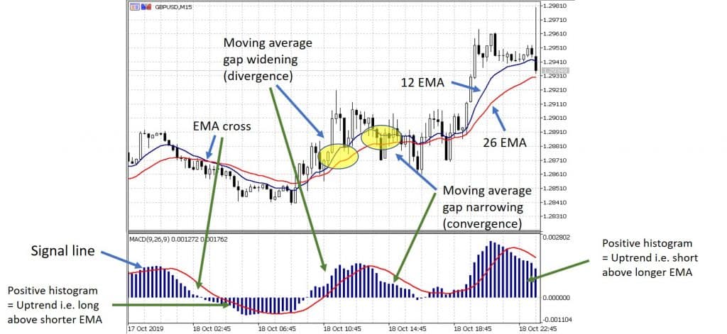
We have illustrated with the green arrows how the information on the top of the chart relates to the MACD at the bottom.
Now, just to swing back to a point made earlier. The reason we chose the 12 and 26 EMAs on the chart above to help understanding that these are the default settings on a traditional MACD (these are of course adjustable, though most traders wouldn’t choose to do this, nor should without testing).EMA cross and trend direction
There is a ‘centreline’ at a zero point on the MACD you can see if there is a cross of the moving averages; the graph also crosses over this line. If the histogram (the vertical bars) are above the line what this means is that the shorter term (12) EMA is above the longer term (26)EMA. This is indicative of an uptrend.
If the vertical bars are below the line, then the longer EMA is on top (see chart above).Momentum (convergence versus divergence)
As referenced earlier in simple terms if the distance between the moving averages is increasing (divergence), this indicates increasing momentum in the trend (and so is thought to be a sign of potential continuation). If you look on the top chart, you will see how this increasing gap is illustrated on the MACD by increasing height of the bars.Conversely, when the moving averages begin to converge (get closer) then length of the bars decreases, this is suggestive of decreasing momentum in the trend which if continues may ultimately result in trend reversal (and a cross of the two EMAs).
On the Metatrader platform the length of the bars in the histogram is a numeric representation of this gap between the two EMAs (12 and 26).
It is not unreasonable to question (and many do) that if all this information is on the top chart anyway and easily visible what justification is there to add the MACD box?
The signal lines
The answer lies in the only new piece of information, that is termed “signal line” as seen on the MACD example above.
The calculation of how this line is plotted is based on taking a simple moving average (SMA) of the difference between the two EMAs.
It is seen as potentially important when there is a cross of this line above or below the histogram bar height.
The purpose of this line is to potentially give additional information relating to the likelihood of that change in trend momentum and to create a readiness to take action.
To help explain the potential use of this “signal line” let’s use the diagram below which is a “snip” taken from part of the chart as it moves into uptrend.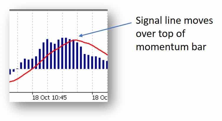
At the start of the uptrend, we see the histogram bar tops over the signal line. As the signal line is a SMA of the height of the bars you note it tracks upwards along with the increased momentum.
Ultimately, as momentum (divergence) begins to “top out”, the height of the bar moves below the signal line. Subsequently, we see a drop-in momentum as the EMAs converge and ultimately the trend ends.
Hence, theoretically this could signal a potential reason to exit a trade.Bringing it all together…
Despite the additional “signal” line many questions the usefulness of adding this to decision making processes.
However, it remains a popular indicator and as such our advice is, as always, not whether to use or not use it in your system, but rather emphasise the importance of testing your trading system.As with any indicator, general trader consensus is that NO indictor should be used in isolation. Certainly, there is no information within the MACD that shows whether an asset is overbought or oversold, whether there is associated volume, and of course no accounting for the proximity of key price points (support and resistance), nor the potential impact of economic data.
Logic would suggest that all of these are worth consideration alongside the MACD if you are choosing to integrate it within your system.
There is some practical use of this that seem odd. For example, if your “favoured” moving averages on a chart are let’s say 5 and 15 and yet you are using the default 12 and 26 EMAs as part of your MACD set up, this is worth exploring.The fact that much of the MACD information is easily seen on a standard chart is a compelling reason perhaps to test a system with and without MACD and simply look at results.
Ultimately, and to finish, it is of course your choice as to which criteria you use. Remember, whatever these are for you, the key lessons of specifically identifying how you are to use the criteria within your plan, the importance of forward testing (as well as back-testing) of any system change, and of course the discipline of following through are critical whether you use the MACD or don’t.
Ready to start trading?
Disclaimer: Articles are from GO Markets analysts and contributors and are based on their independent analysis or personal experiences. Views, opinions or trading styles expressed are their own, and should not be taken as either representative of or shared by GO Markets. Advice, if any, is of a ‘general’ nature and not based on your personal objectives, financial situation or needs. Consider how appropriate the advice, if any, is to your objectives, financial situation and needs, before acting on the advice. If the advice relates to acquiring a particular financial product, you should obtain and consider the Product Disclosure Statement (PDS) and Financial Services Guide (FSG) for that product before making any decisions.
Next Article
6 Practical Steps to Improve Trading Discipline: #3 Create the motivation to consider change
In our previous articles we introduced the SIX steps to improving your trading discipline, offered some guidance on developing “awareness” and explored how to prioritise the trading discipline areas. If you haven’t yet read these articles, perhaps it is worth checking them out before moving onto this one. Step 1 - Awareness St...
November 6, 2019Read More >Previous Article
The Loonie – Best Performing G10 Currencies
The Loonie Best Performing G10 Currencies After a tight campaign marred by scandals, Justin Trudeau secured another term as Prime Minister. Unlike...
October 24, 2019Read More >
- Trading
- Trading
- Trading
- Markets
- Markets
- Products overview
- Forex
- Commodities
- Metals
- Indices
- Shares
- Cryptocurrencies
- Treasuries
- ETFs
- Accounts
- Accounts
- Compare our accounts
- Our spreads
- Funding & withdrawals
- Volume rebates
- Open account
- Try free demo
- Platforms & tools
- Platforms & tools
- Platforms
- Platforms
- Platforms overview
- TradingView
- MetaTrader 4
- MetaTrader 5
- MetaTrader Copy Trading
- cTrader
- cTrader copy trading
- Mobile trading platforms
- GO WebTrader
- PAMM
- Premium trading tools
- Premium trading tools
- Tools overview
- VPS
- Genesis
- Education
- Education
- Resources
- Resources
- News & analysis
- Education hub
- Economic calendar
- Earnings announcements
- Help & support
- Help & support
- About
- About
- About GO Markets
- Our awards
- Sponsorships
- Client support