
ข่าวสารตลาด & มุมมองเชิงลึก
ก้าวนำตลาดด้วยมุมมองเชิงลึกจากผู้เชี่ยวชาญ ข่าวสาร และการวิเคราะห์ทางเทคนิค เพื่อเป็นแนวทางในการตัดสินใจซื้อขายของคุณ.
Central Banks
Market insights
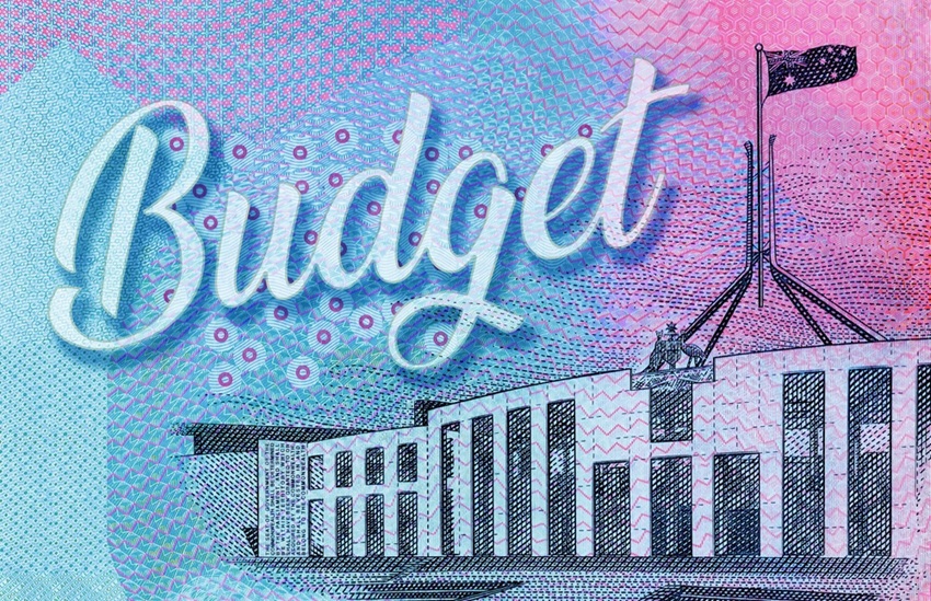
Tuesday, 12 May 2026, at roughly 7:30 pm AEST, Treasurer Jim Chalmers will stand up in Canberra and deliver the 2026-27 Federal Budget. According to Budget.gov.au, that is when the Budget is officially released, with the Budget papers going live online at the same time.
GO Markets
•
May 10, 2026
No items found.