Notícias de mercado & insights
Mantenha-se à frente dos mercados com insights de especialistas, notícias e análise técnica para orientar suas decisões de negociação.

A temporada de resultados de abril nos EUA está chegando a um mercado que quer mais do que uma boa história. JPMorgan já estabeleceu um alto padrão com um resultado forte, e a atenção agora está se voltando para a sala de máquinas do S&P 500: infraestrutura de IA, na qual três empresas estão no centro dessa história.
Por que essa janela de ganhos é importante para a IA
Microsoft, Alphabet e NVIDIA não são apenas participantes do ciclo de IA, elas estão construindo a arquitetura física e de software da qual outras empresas dependem: os chips, as regiões da nuvem, os modelos e as ferramentas. Se esses gastos gerarem retornos, os primeiros sinais podem começar a aparecer em seus resultados trimestrais nas próximas semanas.
Cada empresa representa um teste diferente.
- Microsoft: Se a adoção da IA corporativa está se traduzindo em expansão de receita e margem
- Alfabeto: Se possuir a pilha completa, de chips à nuvem e distribuição, é uma vantagem duradoura ou simplesmente uma posição cara a ser defendida
- NVIDIA: Se o ciclo de hardware ainda está se mantendo, acelerando ou começando a se estabilizar
Em 2026, a questão não é mais se o investimento em IA está acontecendo, os compromissos de capital são substanciais e já declarados publicamente. A questão é se esses gastos estão gerando retornos com rapidez suficiente para justificar a escala dessas apostas.


US earnings season is where the market gets its cleanest burst of new information. For Australians, it usually lands while the country is asleep. This is not just “US company news”. It is the scoreboard for the Nasdaq, the S&P 500, and risk appetite more broadly, with spillover into SPI futures, the AUD, and sector mood at the ASX open.
What this guide covers
- The four-wave rhythm (why volatility clusters in predictable months)
- The order of play (banks → tech → retailers) and what each group tends to reveal
- Before market open (BMO) vs after market close (AMC)
- The few lines markets care about (surprise vs expectations, and the forward reset)
- How earnings information can flow through to Australia via futures, FX, and sector sentiment
US earnings season basics
Earnings season is the 4 to 6-week window after each quarter when most US-listed companies report a new set of numbers and a new story.
Calendar rhythm and clustering
Earnings does not arrive as a smooth drip. It typically arrives in four recurring waves. Most US reporting clusters around January, April, July, and October. Each wave covers the prior quarter, which is why markets spend the lead-up period building expectations, then reprice quickly as numbers and guidance hit.
The sequence is familiar: banks open, tech dominates the middle, retailers close. That order matters because each group updates a different part of the macro story. If you only track one set of reports, make it the Magnificent 7 — here’s the Mag 7 earnings calendar for 2026 (Aussie-friendly timing)
.png)
Time zones: the two windows
For Australians, the key is when the first move hits.
- AMC (after market close): often Sydney and Melbourne morning, sometimes near the ASX open
- BMO (before market open): often late night, with the initial reaction while Australia sleeps
Daylight saving shifts timings, but the structure is consistent: two windows, two different liquidity conditions.
How the market digests an earnings event
Earnings is rarely a single reaction. It is a sequence.
- Headline release (EPS and revenue versus consensus)
- Immediate price discovery (often in after-hours or pre-market liquidity)
- Call and Q&A (guidance, margins, and demand tone get tested)
- Next US cash session (follow-through, reversals, broader positioning)
- Australia opens into the aftershock (futures, FX, and sector mood already set)
Translation: volatility often clusters around reporting windows because the calendar can concentrate new information and repricing.
Expectations: the scoreboard the market uses
Markets do not price “good” or “bad” in isolation. They price the gap versus expectations, then adjust the forward story. That is why the same quarter can look strong on paper and still disappoint if it lands below what the market had already baked in.
Most headlines boil down to three checks. First, actual results versus consensus. Second, actual results versus what the company previously guided. Third, quality and durability. That tends to show up in margins, the mix across segments, and whether cash flow backs up the earnings number.
Guidance: the forward reset
Guidance is where the narrative can change without the quarter changing. A company can deliver the past cleanly, then move the goalposts for what comes next. That forward reset is often what drives the bigger repricing.
In practice, guidance usually lands in a few buckets. Revenue or EPS outlook sets the top-line and earnings path. Margin outlook tells you how confident management is about costs and pricing. Capex language signals how heavy the investment cycle is likely to be. Capital return talk, including buybacks, is a read on balance sheet posture and priorities.
Translation: markets trade forward narratives. Guidance is the mechanism.
The call: where tone becomes data
Prepared remarks are polished. The call is where the market stress-tests the story. The Q&A is where the edges show up, because that is where analysts push on the parts that matter and management has to answer in real time.
Listen for the tells. Demand language can shift from broad to patchy. Pricing can move from power to pressure. Margin confidence can sound steady or start to carry caveats. And the “we are not breaking that out” moments matter too. What management avoids can be as informative as what it highlights.
Key takeaways
- Earnings season clusters in four waves (January, April, July, October), so volatility often arrives in blocks.
- The sequence matters. Banks open the read on confidence, tech steers index tone, retailers often close the consumer chapter.
- From Australia, BMO and AMC are the two windows that shape what you wake up to.
- Markets trade surprise vs expectations, then the forward reset via guidance and call tone.
- The spillover typically shows up through futures, FX, and sector sentiment before the ASX open.
Glossary (quick definitions)
- EPS: earnings per share
- Consensus: the market’s compiled estimate set
- Guidance: management’s forward-looking outlook ranges/comments
- Margins: profitability as a percentage of revenue
- Capex: capital expenditure (investment spend)
- BMO/AMC: before market open / after market close (US reporting labels)
- After-hours / pre-market: trading sessions outside regular US cash hours
- Correlation: how tightly assets move together (often rises in macro or de-risking periods)


As geopolitical narratives continue to simmer, US and European markets move into the rest of the week with three dominant drivers: US inflation data, the start of US earnings season, and an unusual Fed-independence headline risk after the DOJ subpoenaed the Federal Reserve.
Quick facts:
- US consumer price index (CPI) and producer price index (PPI) are the key macro releases and are likely to impact the US dollar (USD) and other asset classes if there is a significant move from expectations.
- JPMorgan reports Tuesday, with other major US banks through the week, as the Q4 reporting season gets underway.
- Reporting around DOJ action involving the Fed, and Chair Powell’s prior testimony, created early market volatility on Monday, with markets sensitive to anything that may be perceived as undermining Fed independence.
- President Trump announced this morning that any country doing business with Iran will face a 25% tariff on all business with the US, effective immediately.
- Europe’s production and growth updates, including Eurozone industrial production and UK monthly GDP and trade data, are later in the week.
United States: CPI, Fed path, DOJ and Fed headline risk, and banks leading earnings
What to watch:
The US is carrying the highest event density in global data releases this week. CPI and PPI will both be watched for moves away from expectations.
Any meaningful surprise can shift Fed policy expectations. Markets are currently pricing a lower likelihood of a March rate cut (under 30%) than this time last week, based on fed funds futures probabilities tracked by CME FedWatch.
Bank earnings may set the tone for the reporting season as a whole. Forward guidance is likely to be as important as Q4 performance, with valuations thought to be high after another record close in the S&P 500 overnight.
Key releases and events:
- Tue 13 Jan (Wed am AEDT): CPI (Dec) (high sensitivity)
- Tue 13 Jan (Wed am AEDT): JPMorgan earnings before market open (high sensitivity for banks and risk tone)
- Wed to Thu: additional large-bank earnings cluster (high sensitivity for financials sentiment)
- Wed 14 Jan (Thu am AEDT): US PPI
- Thu 15 Jan (Fri am AEDT): US weekly unemployment
- Throughout the week: Fed member speeches
How markets may respond:
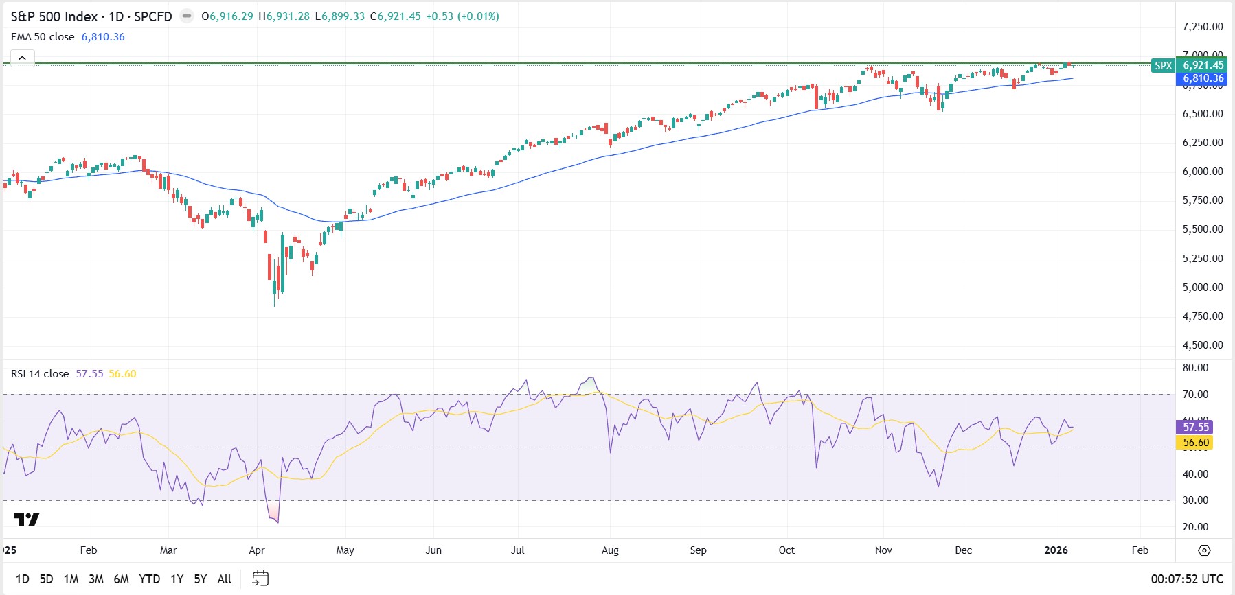
S&P 500 and US risk tone: US indices are near record levels. The S&P 500 closed at 6,977.27 on Monday. Hotter-than-expected inflation can pressure growth and small-cap equities in particular, and weigh on the market broadly. Softer inflation can support further risk-on behaviour.
USD: Inflation data is the obvious driver this week for the greenback, but any continuation of DOJ and Fed developments, or geopolitical escalation, may introduce additional USD influences.
With the USD testing the highest levels seen in a month, followed by some light selling yesterday, some volatility looks likely. Gold has also been bid as a potential safety trade and hit fresh highs in the latest session, suggesting demand for defensive exposure remains present.
Earnings (banks): In a market already priced near highs, results can still create volatility if they are not accompanied by supportive earnings per share (EPS), revenue and forward guidance. Financials will likely see the first-order response, but any early pattern in results and guidance can influence the broader market beyond the first few days.
UK and Eurozone: growth data influence amid continuing equity strength
What to watch:
In a week where Europe may be driven primarily by events in the US and geopolitical narrative, the Eurozone industrial production print is still a noteworthy local release.
In the UK, monthly GDP and trade numbers on Thursday may influence both the FTSE 100 and the pound, particularly if there is any meaningful surprise.
Key releases and events:
Eurozone
- Wed 14 Jan: Eurozone industrial production (Nov 2025) (medium sensitivity for cyclical sectors)
UK
- Thu 15 Jan: GDP monthly estimate (Nov 2025) (high sensitivity for GBP and UK rate expectations)
- Thu 15 Jan: UK trade (Nov 2025) (low to medium sensitivity)
How markets may respond:
EUR spillover from the US: Despite light Eurozone data, the US response is likely to matter most this week, with the US dollar index a major driver of broader G10 FX direction.
DAX (DE40): Germany’s index is also trading at or near record levels and closed at 25,405 on Monday. (2) If the index is extended, it may react more to global rate moves and shifts in perceived risk.
FTSE 100 and GBP: The FTSE hit a new high in the overnight session, driven particularly by materials and mining stocks. (5) Any GDP surprise can re-price GBP and UK equities quickly in an environment where growth concerns persist.
US and Europe calendar summary (AEDT)
- Wed 14 Jan: US CPI, US bank earnings kick-off (notably JPMorgan)
- Wed 14 Jan: Eurozone industrial production (Nov 2025)
- Thu 15 Jan: UK monthly GDP (Nov 2025) and UK trade (Nov 2025), US bank earnings continue
- Fri 16 Jan: US weekly unemployment, US bank earnings continue
Bottom line
- If US CPI surprises higher, markets may lean toward higher-for-longer interest rate pricing, which can pressure equity multiples and lift rates volatility.
- If bank earnings are solid but guidance is cautious, equities can still see two-way swings given index levels near records and high valuations.
- If DOJ and Fed headlines escalate, they may override normal data reactions to some degree. That could increase demand for perceived safe havens such as gold and lift FX volatility.
- For Europe, Eurozone production (Wed) and UK GDP and trade (Thu) are the key local data. The region is still likely to trade primarily off US outcomes and broader risk sentiment.


So why do Magnificent 7 (Mag 7) earnings matter for Australians? Because the US earnings season is a different sport from Australia, and this is where the scoreboard sits. These seven names do not just report results, they set the tone for the Nasdaq, the S&P 500, and risk appetite more broadly. They often influence index tone, but market moves are not guaranteed and can fade or reverse.
The Aussie edge: time zones, event windows, and what gets priced
For Aussie traders, the challenge is not just timing. It's overnight gaps, liquidity, and AUD/USD currency moves that can amplify or offset the share price reaction.
Most Mag 7 results land after the US close, so the initial move often hits Sydney morning liquidity. Markets may react first to the headline numbers, then again during the call as guidance, margins and capex are digested — but the sequence varies by quarter.
What this guide gives you, company by company
For each company, we map the US Eastern Time (ET) reporting window and the Sydney time window (AEDT), flag whether it is before or after the US close, and narrow the focus to the few drivers that tend to move price.

Apple Inc (NASDAQ: AAPL)
Apple is a “quality” print until it isn’t. The market doesn’t just ask if Apple beat. It asks whether demand and mix support the next leg.
Reporting window (confirmed)
- US reporting time: Thu, 29 Jan 2026 at 5:00 pm ET (after close)
- AU reporting time: Fri, 30 Jan 2026 at 9:00 am AEDT
Quarter snapshot (Q1)
- Projected consensus earnings per share (EPS): US$2.65
- Projected consensus revenue: US$135.86 billion (bn)
- Call focus: iPhone demand and mix, services trajectory, China and FX translation
Translation: Apple “beats” are common. The repricing comes from demand tone and margin language.
Earnings expectations and how the market will frame it
A “beat” means EPS and revenue come in above expectations, but it only really counts if demand still sounds healthy and the gross margin commentary stays straightforward.
A “meet” means results are basically in line, so attention shifts to the call. Investors will focus on iPhone product mix, how fast Services is growing, and whether any specific regions are weakening.
A “miss” often reacts more negatively if it is driven by weaker demand, because the market may treat it as the start of a trend, not a one time issue. You can also see a big price gap right after the report, before the call even starts.

Meta Platforms Inc (NASDAQ: META)
Meta is expected to report the December quarter, which effectively turns this into a Sydney morning catalyst for Aussie traders. The headline move hits first but the second leg often comes from the call, when guidance and capex ranges get priced.
Reporting window (expected)
- US reporting time: Mon, 2 Feb 2026 at 4:05 pm ET (after close)
- AU reporting time: Tue, 3 Feb 2026 at 8:05 am AEDT
Quarter snapshot (Q4)
- Projected consensus EPS: US$8.29
- Projected consensus revenue: US$58.27 bn
- Call focus: AI infrastructure capex, Ads demand plus Reels monetisation and Reality Labs losses versus discipline
Translation: Meta can beat the print and still sell off if the Street hears “higher spend, longer payoff.”
Earnings expectations and how the market will frame it
A “beat” means EPS and revenue come in above consensus, but it only really counts if guidance stays intact and the 2026 capex and expense ranges do not get wider.
A “meet” is close enough that the stock trades the tone of the call: how broad ad demand looks, whether Reels monetisation is improving, and whether spending sounds capped or more open ended.
A “miss” can turn ugly quickly if it comes with weaker ad demand commentary or higher spend bands. With expectations already high, the initial gap can be sharp, and what happens next depends on whether guidance can steady the story.

Alphabet Inc (NASDAQ: GOOGL)
Alphabet is still an ads engine first, and a Cloud and AI story second. The market wants proof that Cloud profitability and AI spend can coexist without compressing the whole narrative.
Reporting window (confirmed)
- US reporting time: Wed, 4 Feb 2026 at 4:00 pm ET (after close)
- AU reporting time: Thu, 5 Feb 2026 at 8:00 am AEDT
Quarter snapshot (Q4)
- Projected consensus EPS: US$2.59
- Projected consensus revenue: TBC
- Call focus: Search and YouTube ads pricing and volume, Cloud growth and profitability, AI capex and monetisation signals
Translation: The market forgives a lot if ads are strong and Cloud margins keep improving.
Earnings expectations and how the market will frame it
A “beat” means EPS and revenue come in above consensus, but it only really matters if ad demand sounds broad and Cloud profitability does not slip while AI spending ramps.
A “meet” puts the call in the driver’s seat, with investors listening for ad pricing trends, YouTube momentum, and whether capex is moving higher.
A “miss” hurts most if it is driven by weaker ads, because then the market starts debating the ad cycle, not just the company.

Amazon.com Inc (NASDAQ: AMZN)
Amazon is two businesses stapled together in the tape. The market uses AWS to price growth and uses retail margins to price discipline.
Reporting window (expected)
- US reporting time: Mon, 2 Feb 2026 at 4:00 pm ET (after close)
- AU reporting time: Tue, 3 Feb 2026 at 8:00 am AEDT
Quarter snapshot (Q4)
- Prijected consensus EPS: US$1.97
- Projected consensus revenue: US$211.33 bn
- Call focus: AWS growth and margins, retail profitability/fulfilment efficiency, advertising momentum, capex tone
Translation: AWS decides the direction. Retail decides the confidence.
Earnings expectations and how the market will frame it
A “beat” means EPS and revenue come in above consensus, but it only really matters if AWS holds steady or speeds up again and management does not worry the Street with spending plans.
A “meet” puts AWS and margin tone front and centre, and the call does most of the work.
A “miss” usually gets hit hardest when AWS growth slows or operating income guidance disappoints, because that is what can reset the whole valuation debate.

Microsoft Corp (NASDAQ: MSFT)
Reporting window (confirmed)
- US reporting time: Wed, 28 Jan 2026 at 4:00 pm ET (after close)
- AU reporting time: Thu, 29 Jan 2026 at 8:00 am AEDT
Quarter snapshot (Q2)
- Projected consensus earnings per share (EPS): US$3.86
- Projected consensus revenue: US$80.09 bn
- Call focus: Azure growth, AI monetisation (Copilot/attach), capex intensity, and margin trajectory
Translation: This is usually a cloud plus capex trade, not an EPS trade.
Earnings expectations and how the market will frame it
A “beat” means EPS and revenue come in above consensus, but it only really matters if Azure is holding up and capex does not sound unlimited. Beat plus steady cloud trends and stable margins is the upside script the tape usually rewards.
A “meet” puts the focus on the call, especially Azure growth, commercial bookings tone, and how quickly capex is stepping up.
A “miss” usually gets punished most when cloud growth slows or margins get shaky, because that is the key forward anchor the market leans on.

NVIDIA Corp (NASDAQ: NVDA)
Nvidia is the season’s last boss. Markets treat it like a read-through on AI capex itself. The print matters, but guidance and gross margin are the real price setters.
Reporting window (confirmed)
- US reporting time: Wed, 25 Feb 2026 at 4:20 pm ET (after close)
- AU reporting time: Thu, 26 Feb 2026 at 8:20 am AEDT
Quarter snapshot (Q4)
- Projected consensus EPS: US$1.45
- Projected consensus revenue: US$65.47 bn
- Call focus: Data centre demand versus capacity, gross margin trajectory, supply/lead times, next-quarter guide
Translation: Guidance and gross margin commentary often drive the reaction, but outcomes vary.
Earnings expectations and how the market will frame it
A “beat” means EPS and revenue come in above consensus, but it only really matters if the next quarter outlook confirms demand is still strong and the gross margin message stays solid.
A “meet” means the call becomes the decider, and the stock trades the outlook, margins, and what management says about supply conditions.
A “miss” can gap down fast, especially if it comes with softer forward guidance, because the market may take it as a clue about the broader AI spending cycle.

Tesla Inc (NASDAQ: TSLA)
Tesla’s earnings are rarely just about the quarter. The print hits first, but the real repricing usually happens when the call clarifies margins, demand, and the autonomy timeline. For Aussie traders, it’s a Sydney morning catalyst.
Reporting window (confirmed)
- US reporting time: Wed, 28 Jan 2026 at 4:05 pm ET (after close)
- AU reporting time: Thu, 29 Jan 2026 at 8:05 am AEDT
Quarter snapshot (Q4)
- Projected consensus EPS: US$0.44
- Projected consensus revenue: US$25.15 bn
- Call focus: Autonomy/robotaxi cadence, auto gross margin, pricing/demand and energy storage scale
Translation: Tesla can “beat” and still get sold if margins compress or the roadmap tone shifts.
Earnings expectations and how the market will frame it
A “beat” means EPS and revenue come in above consensus, but it only really matters if the margin story stays intact and management does not add fresh uncertainty around pricing or timing.
A “meet” is close enough that the stock trades the tone of the call, especially on demand, how durable margins look, and progress toward autonomy milestones.
A “miss” gets hit fastest when it comes with weaker margin language or softer demand comments, because the market will assume next quarter looks tougher, not easier.


Ahead of the US nonfarm payrolls (NFP) release (Friday, 9 January, 8:30 am ET/ Saturday, 10 January, 12:30 am AEDT), major US equity indices have been trading near recent highs (as at 9 January 2026).
Next week, attention is likely to shift to inflation data, any change in expectations for Federal Reserve (Fed) policy, and the start of US earnings season. Together, these may support or challenge current valuations.
Quick facts:
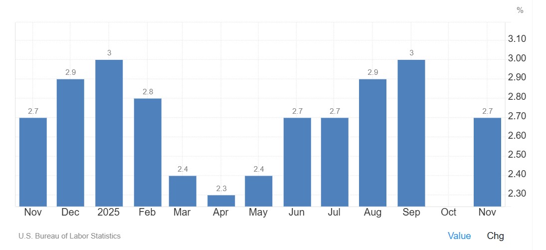
US inflation: The consumer price index (CPI) and producer price index (PPI) releases will test whether inflation is showing signs of persistence.
Earnings season: Major US banks report first, providing an early read on financial conditions and whether current valuations can hold up.
Gold futures: Gold futures remain close to record levels, with US dollar (USD) moves after key data a potential swing factor.
Geopolitics: Ongoing tensions remain on the radar and could influence risk sentiment.
US inflation data: could CPI and PPI shift rate-cut expectations?
Timing:
- CPI: Wednesday 14 January, 12:30 am AEDT
- PPI: Thursday 15 January, 12:30 am AEDT
CPI and PPI are the major scheduled macro events for the week. The updated inflation prints across consumer and producer prices will help markets assess whether disinflation is continuing or whether inflation is showing signs of persistence.
Market impact:
- A softer outcome could support risk sentiment and weigh on Treasury yields and the USD. However, reactions can vary depending on positioning and broader macro headlines, including how confidently markets price a March Fed rate cut.
- A stronger-than-expected reading may pressure equities and reinforce caution in bond markets.
US earnings season begins with the banks
Timing:
- JPMorgan Chase (JPM): Tuesday, 6:35 am ET
US earnings season begins with results from major banks, providing an early snapshot of financial conditions and economic momentum. Investor attention is likely to extend beyond headline earnings to guidance and management commentary.
Market impact
- Strong results versus earnings per share (EPS) and revenue expectations could support sentiment, particularly within financials.
- Cautious forward guidance may pressure share prices and could weigh on broader indices if it becomes a common theme.
- Early bank prints can shape expectations for the wider season. Watch how the first reporters in each sector influence related stocks.
Gold futures to retest record highs?
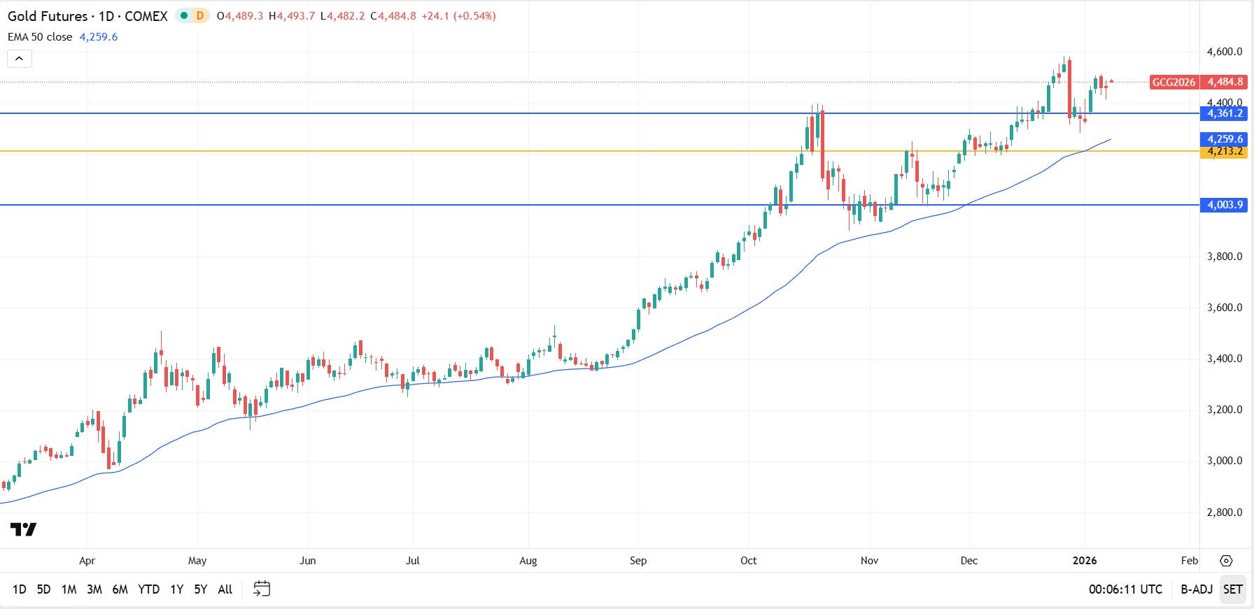
After a recent pullback, gold futures are trading within striking distance of record highs again. The backdrop remains a mix of geopolitical uncertainty and the potential for data-driven moves in the USD.
Market impact
- Continued strength could support a retest of late December highs around US$4,585.
- The short-term US$4,500 area may act as a short-term technical resistance in determining whether upside momentum can hold.
- Another pullback may occur if yields rise or the USD strengthens following key data releases.
Geopolitics remains in focus
Geopolitics remains a background market consideration, with headlines and broader policy messaging sometimes influencing risk sentiment. Markets have shown resilience to date, but sensitivity may rise if developments escalate.
Market impact
- Escalation could influence energy prices, defence stocks, and hedging assets such as gold.
- A cooling in the narrative may reduce volatility and allow markets to refocus on macro data and earnings.
Economic calendar
All dates and times may be subject to change.


Venezuela commands the world's largest proven oil reserves at 303 billion barrels. Yet political turmoil, global sanctions, and recent US intervention show that being the biggest isn’t always best.
Quick facts:
- Venezuela holds 18% of the world's total proven oil reserves despite producing less than 1% of global consumption.
- Just four countries (Venezuela, Saudi Arabia, Iran, and Canada) control over half the planet's proven reserves.
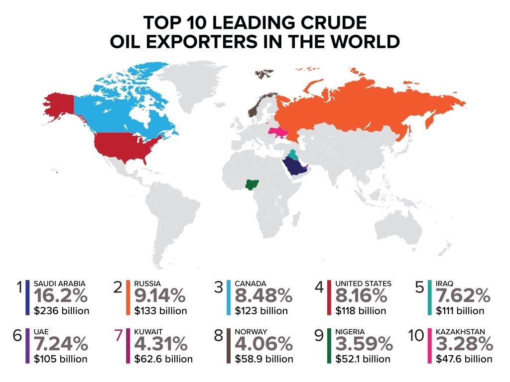
- Saudi Arabia dominates crude oil production contributing to over 16% of global exports.
- US shale technology has enabled America to lead in production despite ranking ninth in reserves.
Top 10 countries by proven oil reserves
1. Venezuela – 303 billion barrels
- Controls 18% of global reserves, primarily extra-heavy crude in the Orinoco Belt requiring specialised refining.
- Heavy crude trades $15-20 below Brent benchmarks due to high sulphur content and complex processing requirements.
- Output crashed 60% from 2.5 million bpd in 2014 to less than 1.0 million bpd last year.
- Approximately 80% of exports flow to China as loan repayment, with export revenues dwarfed by reserve potential.
2. Saudi Arabia – 267 billion barrels
- Majority light, sweet crude oil requires minimal refining and commands premium prices, contributing to world-leading exports of $191.1 billion in 2024.
- Maintains 2-3 million bpd of spare production capacity, providing market stabilisation capability during supply disruptions.
- Oil comprises roughly 50% of the country’s GDP and 70% of its export earnings.
- Production decisions significantly impact international oil prices due to market dominance.
3. Iran – 209 billion barrels
- Heavy Western sanctions severely limit the country’s ability to monetise and access international markets.
- Production estimates vary significantly (2.5-3.8 million bpd) due to sanctions, limited transparency, and restricted international reporting.
- Significant crude volumes flow to China through discount arrangements and sanctions-evading mechanisms.
- Sanctions relief could rapidly boost production toward 4-5 million bpd, though domestic consumption (12th globally) reduces export potential.
4. Canada – 163 billion barrels
- Approximately 97% of reserves are oil sands (bitumen) requiring steam-assisted extraction and significant upfront capital investment.
- Political stability and regulatory frameworks position Canada as a secure source compared to volatile producers, with direct pipeline access to US refineries.
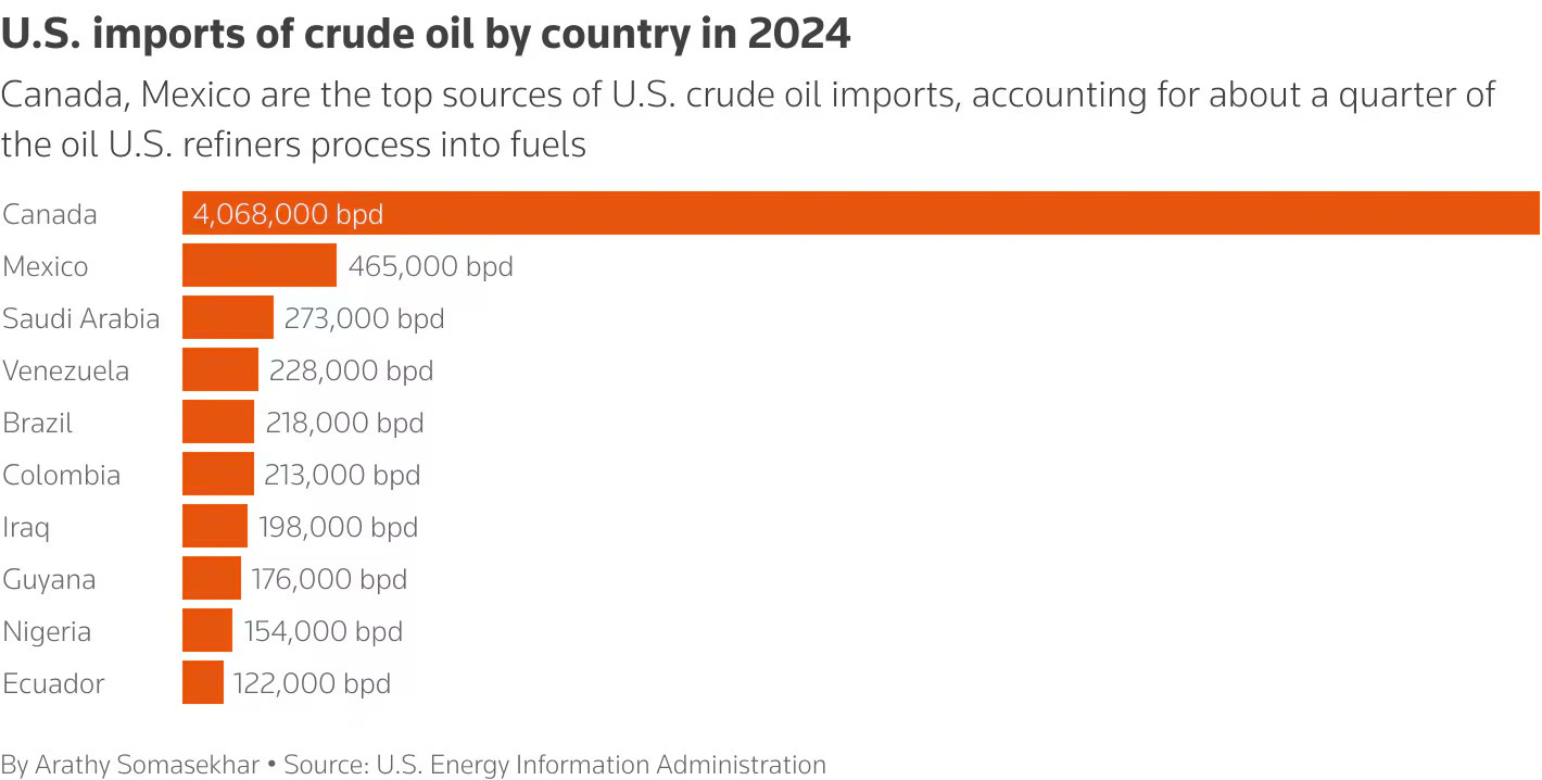
- Supplied over 60% of U.S. crude oil imports in 2024, making Canada America's top source by far.
5. Iraq – 145 billion barrels
- Decades of war and sanctions have prevented optimal field development and infrastructure modernisation.
- Improved security conditions since 2017 have enabled production recovery, but pipeline attacks and aging facilities continue to constrain output.
- Oil revenue comprises over 90% of government income, creating extreme fiscal vulnerability.
- Exports flow primarily to China, India, and Asian buyers seeking a reliable Middle Eastern supply, with most production from super-giant southern fields near Basra.
6. United Arab Emirates – 113 billion barrels
- Produces primarily medium-to-light sweet crude commanding premium prices, ranking fourth globally in export value at $87.6 billion.
- Has successfully diversified its economy through tourism, finance, and trade, reducing oil's GDP share compared to Gulf peers.
- Strategic location near the Strait of Hormuz and openness to international oil companies help facilitate efficient global distribution.
7. Kuwait – 101.5 billion barrels
- Reserves are concentrated in aging super-giant fields like Burgan, which require enhanced recovery techniques.
- Favourable geology enables extraction costs around $8-10 per barrel, with proven reserves providing 80+ years of supply at current production rates.
- Oil comprises 60% of GDP and over 95% of export revenue.
8. Russia – 80 billion barrels
- World's third-largest producer despite ranking eighth in reserves.
- Post-2022 Western sanctions redirected crude flows from Europe to Asia, with China and India now absorbing the majority at discounted prices.
- Despite export restrictions and G7 price cap at $60/barrel, it posted the second-highest global export value at $169.7 billion in 2024.
- Russian Urals crude typically trades $15-30 below Brent due to quality, sanctions, and logistics, with November 2024 revenues declining to $11 billion.
9. United States – 74.4 billion barrels
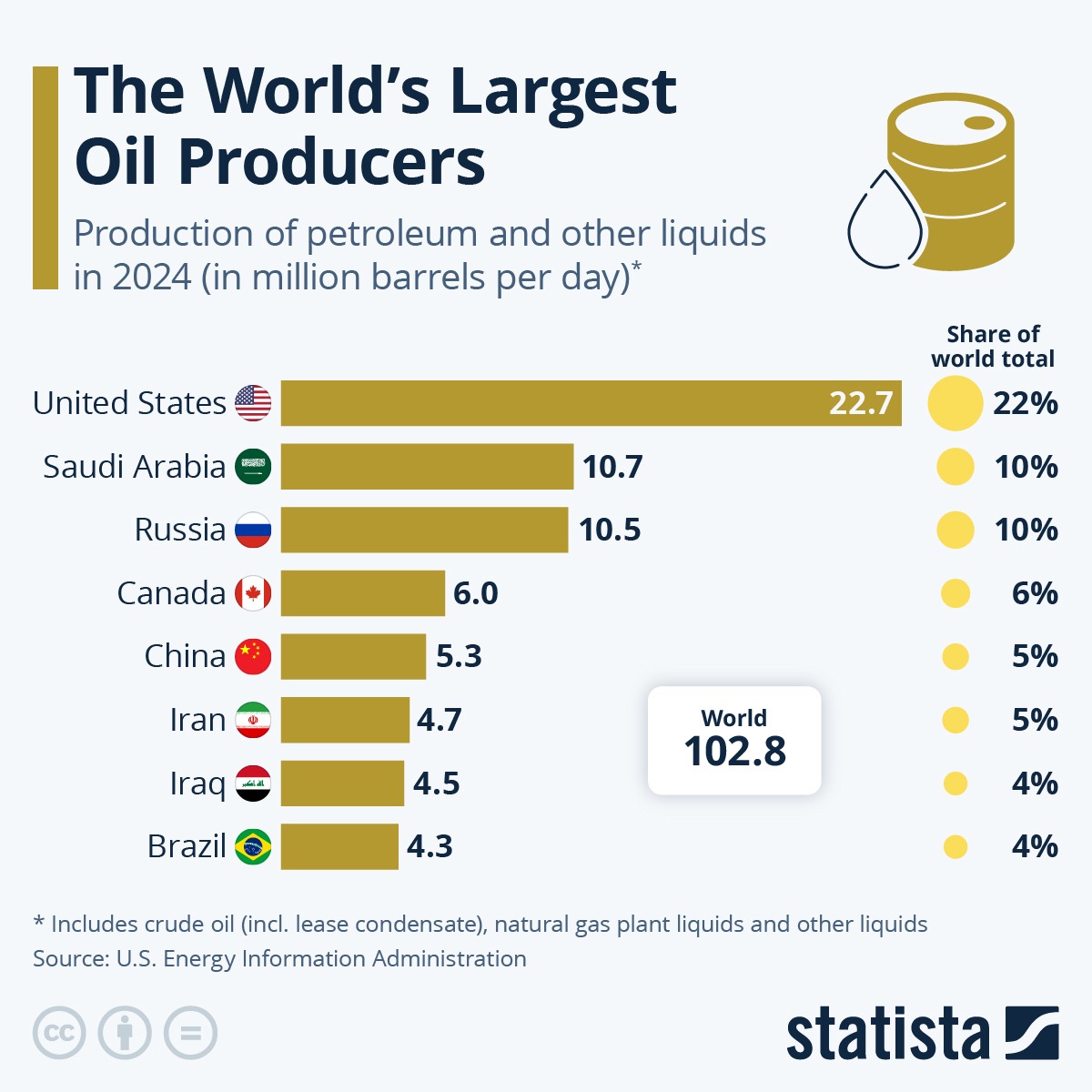
- The shale revolution through horizontal drilling and hydraulic fracturing has made the U.S. the world's #1 oil producer despite holding only the 9th-largest reserves.
- The Permian Basin accounts for nearly 50% of production, with shale/tight oil representing 65% of total output.
- Achieved net petroleum exporter status in 2020 for the first time since 1949, with crude exports growing from near-zero in 2015 to over 4 million bpd in 2024.
- The U.S. government maintains a 375+ million barrel strategic reserve.
10. Libya – 48.4 billion barrels
- Holds Africa's largest proven oil reserves at 48.4 billion barrels, producing light sweet crude commanding premium prices.
- Rival bordering governments compete for oil revenue control, causing production to fluctuate based on political conditions.
- Oil facilities face blockades, militia attacks, and political leverage tactics, preventing consistent returns.
- Favourable geology enables extraction costs around $10-15 per barrel, with geographic proximity making Libya a natural supplier to European refineries.
What does this mean for oil markets?
The concentration of reserves among OPEC members (60% of the global total) ensures the organisation has continued influence over pricing, even as US shale provides a production counterweight.
Venezuela's potential return as a major exporter post-U.S. occupation could eventually ease supply constraints, though most analysts view significant production increases as years away.
Sanctions could create a situation where discounted crude seeks buyers willing to navigate compliance risks. Refiners with heavy crude processing capability may benefit from price differentials if Venezuelan barrels increase.
While reserves appear abundant, economically recoverable volumes depend on sustained high prices. If renewable adoption accelerates and demand peaks sooner than projected, stranded assets become a material risk for reserve-heavy producers.


Global markets are calm but alert in response to the US–Venezuela situation, with US and European equities holding near or testing record levels.
Gains in energy, defence and materials suggest selective positioning. Modest strength in gold and lower yields is indicative of hedging rather than market fear, with oil prices remaining muted.
Quick facts
- US and European equity indices are holding near record highs despite geopolitical headlines. Volatility remains low through the trading session.
- Energy and defence stocks are leading gains, with materials stocks responding to mild gains in previous metals, reflecting selective risk positioning.
- Gold is edging higher, and government bond yields have dipped slightly, signalling mild hedging.
- Oil prices remain range-bound, suggesting no immediate supply shock is being priced in.
- Markets could be sensitive to further geopolitical developments, with any escalation a major potential risk to sentiment.
US–Venezuela tensions escalation has prompted heightened geopolitical scrutiny across the globe, not only related to this action itself but other geopolitical longer-term implications.
There has been a muted and measured response across global financial markets so far, with little significant negative impact evident for now.
Some sectors have had noteworthy gains, whilst the impact on other asset classes has again been calm.
US equities
What’s happening:
US equity markets are showing resilience, with the S&P 500 holding near recent highs and the Dow Jones Industrial Average up 1.23%, pushing into fresh record territory.
What to watch:
- If US indices continue to hold above recent breakout levels, then markets are reinforcing the view that geopolitical risk remains manageable.
- Rising volatility, if seen in the VIX index, may indicate that sentiment may be shifting from selective risk-taking to broader caution.
European equities
What’s happening:
European markets are modestly higher, with the DAX trading at record levels and the FTSE 100 closing over 10,000 for the first time.
What to watch:
- For now, European indices appear to be tracking US strength, suggesting investors are viewing the event as externally contained. Similar sectors are performing well, as seen in overnight US equity performance.
- It is unlikely that we will see any specific regional response, though tensions related to the US administration's narrative around Greenland is noteworthy.
Specific sector moves
Energy stocks
What’s happening:
Energy stocks are leading equity gains across the US (e.g. Chevron Corp – CVX up 5.1%), and European markets, with the potential for increased influence in Venezuela of US oil companies.
What to watch:
- While energy equities outperform while oil prices remain range-bound, then markets are pricing geopolitical caution rather than immediate disruption. If this is accompanied by a rise in crude prices rise together, then it may be indicative of supply risk
Defence stocks
What’s happening:
Defence stocks are attracting some investor interest. (E.g. Lockheed Martin – LMT up 2.92%, General Dynamics – GD up 3.54%).
What to watch:
- Continued outperformance with other sector equity drawdowns may be indicative of some escalation concerns.
Materials & miners
What’s happening:
Materials and mining stocks are finding support alongside modest gains in precious metals and record highs in copper. The S&P Metals & Mining ETF – XME closed 3.28% up.
What to watch:
- Ongoing materials strength alongside stable growth indicators, then the current move may reflect real-asset demand rather than simply a hedging approach. If gold accelerates higher while base metals fail to follow, then investor defensive positioning may be overtaking confidence in growth.
Crude oil
What’s happening:
Oil prices remain subdued, with the futures trading at $58.40, within recent ranges, despite the unfolding geopolitical situation.
What to watch:
- Venezuelan influence on global oil production is not substantial enough on its own to create any major issues in the short term with global oil supply at high levels.
- As a result, the impact is more likely to remain muted, but any significant rises in oil price across multiple sessions may be indicative of some market concerns related to increases in geopolitical-influenced supply expectations.
Gold
What’s happening:
Gold prices are currently edging higher towards all-time highs, reflecting a modest safe-haven play. The closing price for Gold futures is $4454, breaching the psychologically important $4400.
What to watch:
- If gold continues to rise gradually while equities remain firm, then the move reflects a standard hedging approach to assets rather than fear.
- A spike in gold price alongside falling equities and rising volatility, maybe a signal that market risk may be increasing.
Treasury yields
What’s happening:
Yields have eased slightly, indicating a potential selective defensive positioning in asset choice by institutional investors. (10-year Treasury yields at 4.153%, down 0.36%)
What to watch:
- If yields should fall sharply alongside equity weakness, then markets may be shifting toward a risk-off approach.
What to watch next
- If asset-class correlations remain contained, then markets are maintaining confidence in the broader macro backdrop.
- If tensions escalate into broader regional instability or prolonged policy responses, Sharp movements across equities, bonds, and commodities may signify a reassessment of risk.
- If geopolitical developments fail to translate into sustained price dislocation, then the current response is likely to fade.
(All prices quoted correct as of 4.30pm NY time after market close).

