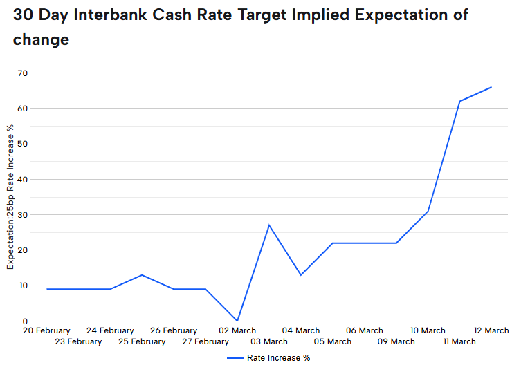
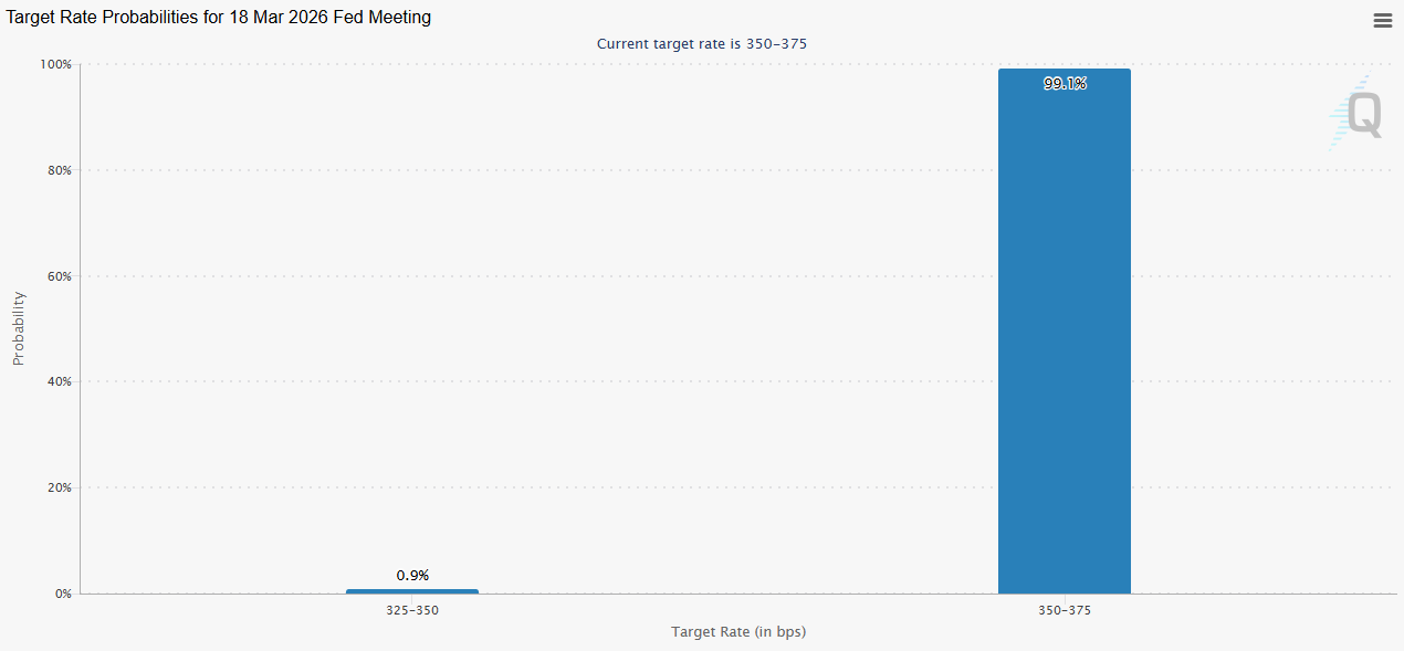
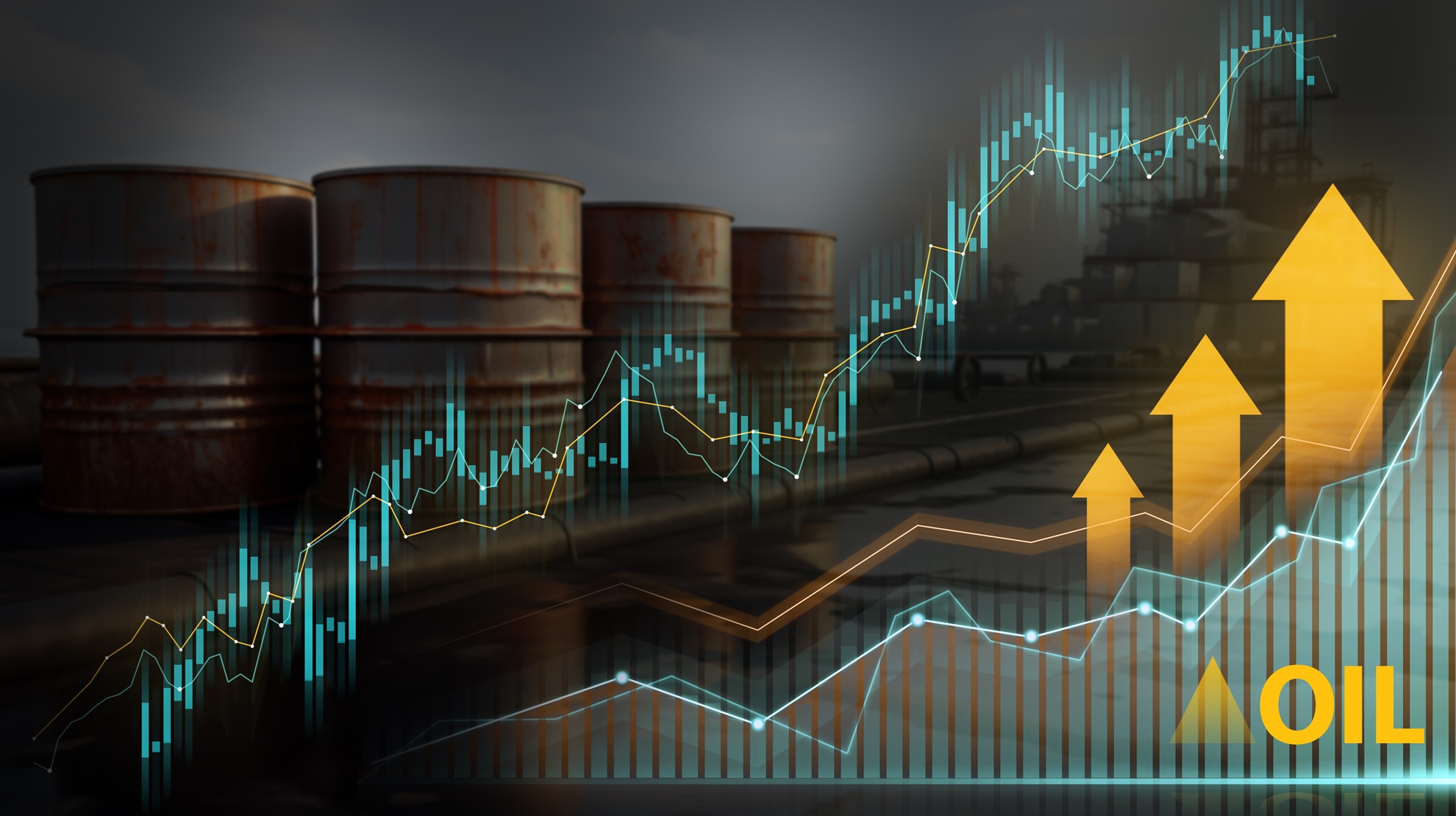
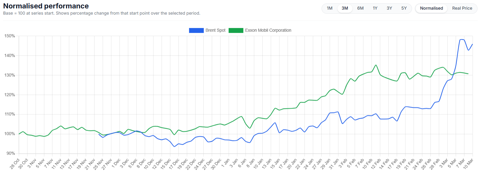
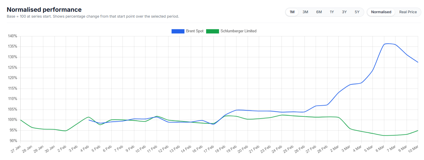
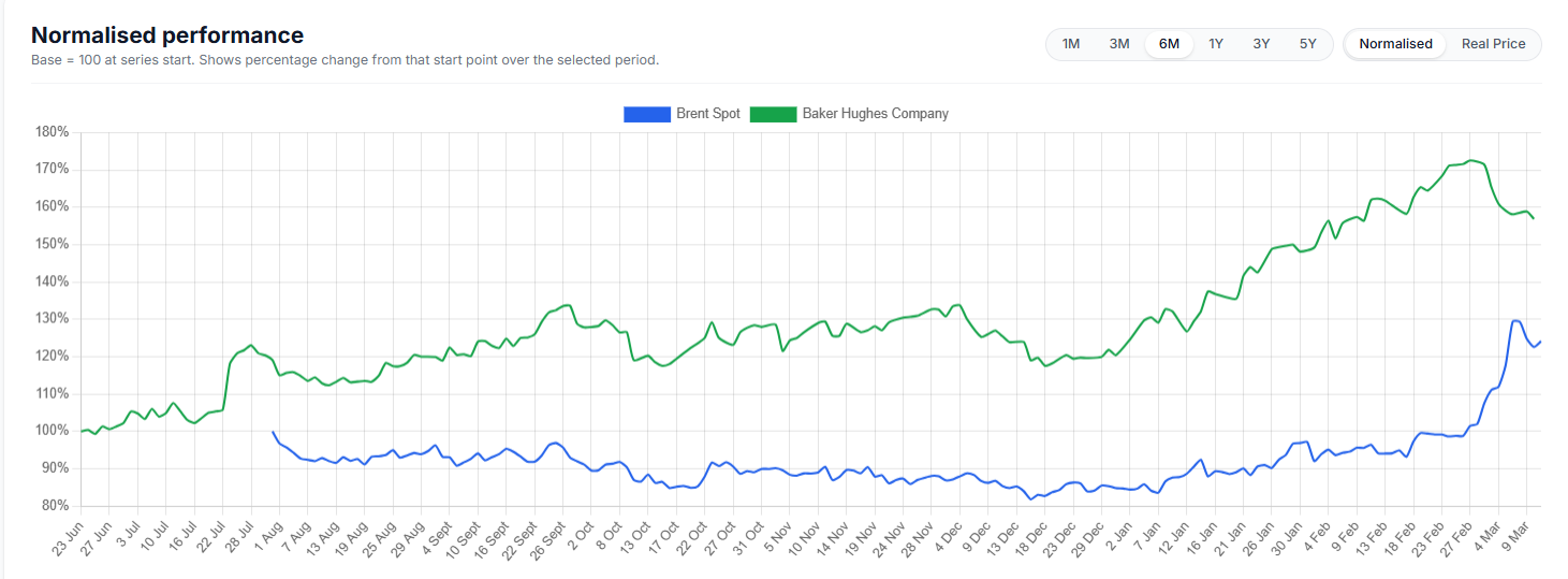
We have deliberately waited a few days before commenting on “Liberation Day” and the fallout that would come from President Trump’s new tariffs regime.It will go down as just another historical period of heightened volatility, uncertainty, risk, and a whole manner of market turmoil. This is why we wanted to put what is happening right now into some context. (If that is possible, considering how volatile the period is and how erratic and how quick the president's manner can change.)US markets have seen this kind of violent move only three times since the 1950s. The S&P’s over 10 per cent drop in the final two sessions of the week following President Trump's "Liberation Day" tariff announcement has it in rare company – and not in a good way - October 1987 (Black Monday), November 2008 (Global Financial Crisis), March 2020 (COVID-19).So, why such a reaction?The market reaction reflects not the ‘shock’ but the scale and brevity of the tariffs. A 10% across-the-board tariff was broadly expected. There were some calculations as much as 15 to 20% judging by the net $1 trillion in and out of the federal government revenue. (This is the impact of DOGE and other government spending cuts coupled with the tariffs now in place that will offset the promised 0% personal income tax for those earning up to US$150,000)But what markets didn’t see coming was the country-specific layer. Take China as an example; the additional 34% reciprocal tariff on Chinese goods pushed the total to 54%. With other measures factored in, the effective burden could approach 65%.Then there were the tariffs that were tied to trade deficits, hitting Japan, South Korea and most emerging markets between the eyes (i.e. Vietnam).The EU saw a 20% rate, which was within expectations, while the UK, Australia, New Zealand and others landed at 10%. Canada and Mexico were spared, as was Russia, North Korea and Belarus, interestingly enough.Energy was excluded, which is unsurprising considering Trump’s goal of getting energy down, down and staying down. Pharmaceuticals and semiconductors were also carved out, however, this is more down to the probability of more targeted action like that of steel and aluminium.Now, what is different about this market shock and risk off trading is that it would send funds flowing to the US dollar, ratcheting it higher. But not this time. The dollar weakened against the euro. Theories as to why range from Europe’s lighter tariff load to euro-based investors pulling money out of the US. The same could be said of the Swiss Franc.All this leads to an average effective tariff rate of around 22%. That number will likely climb once product-specific tariffs on areas like pharmaceuticals and lumber are formalised. Some of this may be negotiated down, but not soon, and the possibility of tit-for-tat retaliation like China has now entered into could actually see it going higher still as the President looks to outdo country responses.The broader uncertainty this introduces to the US outlook is now at its highest since early 2020 and has the markets pricing in 110 basis points of Fed rate cuts this year – a near 5 cut call shows just how unprecedented this is.In fact, in no time in living memory has a developed economy lifted trade barriers this aggressively or abruptly. What has been implemented is textbook economics 101 supply-side shock.Input costs go up, finished goods get pricier, and the ripple effects hit margins and employment. Expect to see this in the next six months.Expect core PCE inflation to finish the year at 3.5% —nearly a full percentage point higher than the consensus forecast from just a week ago.Real GDP growth is forecast to slow to 0.1% on a quarter-on-quarter basis. That path may be volatile as Q1 could look worse due to soft consumption and strong imports, with a mechanical bounce in Q2.What has been lost in the chaos of last Thursday and Friday’s trade was the March Non-farm payrolls jobs print came in at 228,000, which was above consensus, the caveat being it is less so after downward revisions to prior months.Hospitality hiring was strong, likely helped by a weather rebound that won’t repeat. Government payrolls are holding steady for now, but cuts are coming. Layoffs in defence and aerospace (DOGE) are already underway, and tariffs will act as a brake on new hiring. Expect softer reports ahead.Unemployment ticked up slightly to 4.15%, reflecting a modest rise in participation. That’s still within range, giving the Fed cover to hold off on immediate action. But if job losses build pressure on the Fed to act, it will increase quickly.The consensus now is for the first rate cut of this cycle to start in May, triggered by softer April payrolls and earlier signs of deterioration in jobless claims and business sentiment.Zooming out from just a US-centric point of view, the macro standpoint is just as bad if not worse. The scale of tariffs adds pressure on industrial production, trade volumes and cross-border investment.That’s feeding into commodity markets, where the outlook has turned more cautious.Brent is expected to fall into the low US$60s as trade frictions and oversupply build. LNG looks weaker too, with soft Asian demand and less urgency in Europe to restock. Iron ore is more exposed to China, and the reciprocal tariffs put a vulnerability into the price due to the broader global slowdown and higher prices to the US.Looking at China specifically, infrastructure remains a key policy lever that would offset the possible loss of demand in aluminium, copper, and steel. Monetary indicators are beginning to turn, suggesting the start of a new easing cycle. It also suggests that policy remains inward-facing, and a focus on domestic stability would mean a metals-heavy growth path. Thus suggesting Australia could be the ‘lucky country’ once more and could escape the full burden of the global upheaval.In short, the global reaction isn’t just about tariffs. It’s about what happens when policy shocks collide with already-fragile global demand, and central banks are forced to navigate inflation that’s driven by politics, not just price cycles.This is the question for traders and investors alike over the coming period.
Another Period For The History Books.

Related Articles
.jpg)
Every trader has had that moment where a seemingly perfect trade goes astray.
You see a clean chart on the screen, showing a textbook candle pattern; it seems as though the market planets have aligned, and so you enthusiastically jump into your trade.
But before you even have time to indulge in a little self-praise at a job well done, the market does the opposite of what you expected, and your stop loss is triggered.
This common scenario, which we have all unfortunately experienced, raises the question: What separates these “almost” trades from the truly higher-probability setups?
The State of Alignment
A high-probability setup isn’t necessarily a single signal or chart pattern. It is the coming together of several factors in a way that can potentially increase the likelihood of a successful trade.
When combined, six interconnected layers can come together to form the full “anatomy” of a higher-probability trading setup:
- Context
- Structure
- Confluence
- Timing
- Management
- Psychology
When more of these factors are in place, the greater the (potential) probability your trade will behave as expected.
Market Context
When we explore market context, we are looking at the underlying background conditions that may help some trading ideas thrive, and contribute to others failing.
Regime Awareness
Every trading strategy you choose to create has a natural set of market circumstances that could be an optimum trading environment for that particular trading approach.
For example:
- Trending regimes may favour momentum or breakout setups.
- Ranging regimes may suit mean-reversion or bounce systems.
- High-volatility regimes create opportunity but demand wider stops and quicker management.
Investing time considering the underlying market regime may help avoid the temptation to force a trending system into a sideways market.
Simply looking at the slope of a 50-period moving average or the width of a Bollinger Band can suggest what type of market is currently in play.
Sentiment Alignment
If risk sentiment shifts towards a specific (or a group) of related assets, the technical picture is more likely to change to match that.
For example, if the USD index is broadly strengthening as an underlying move, then looking for long trades in EURUSD setups may end up fighting headwinds.
Setting yourself some simple rules can help, as trading against a potential tidal wave of opposite price change in a related asset is not usually a strong foundation on which to base a trading decision.
Key Reference Zones
Context also means the location of the current price relative to levels or previous landmarks.
Some examples include:
- Weekly highs/lows
- Prior session ranges, e.g. the Asian high and low as we move into the European session
- Major “round” psychological numbers (e.g., 1.10, 1000)
A long trading setup into these areas of market importance may result in an overhead resistance, or a short trade into a potential area of support may reduce the probability of a continuation of that price move before the trade even starts.
Market Structure
Structure is the visual rhythm of price that you may see on the chart. It involves the sequences of trader impulses and corrections that end up defining the overall direction and the likelihood of continuation:
- Uptrend: Higher highs (HH) and higher lows (HL)
- Downtrend: Lower highs (LH) and lower lows (LL)
- Transition: Break in structure often followed by a retest of previous levels.
A pullback in an uptrend followed by renewed buying pressure over a previous price swing high point may well constitute a higher-probability buy than a random candle pattern in the middle of nowhere.
Compression and Expansion
Markets move through cycles of energy build-up and release. It is a reflection of the repositioning of asset holdings, subtle institutional accumulation, or a response to new information, and may all result in different, albeit temporary, broad price scenarios.
- Compression: Evidenced by a tightening range, declining ATR, smaller candles, and so suggesting a period of indecision or exhaustion of a previous price move,
- Expansion: Evidenced by a sudden breakout, larger candle bodies, and a volume spike, is suggestive of a move that is now underway.
A breakout that clears a liquidity zone often runs further, as ‘trapped’ traders may further fuel the move as they scramble to reposition.
A setup aligned with such liquidity flows may carry a higher probability than one trading directly into it.
Confluence
Confluence is the art of layering independent evidence to create a whole story. Think of it as a type of “market forensics” — each piece of confirmation evidence may offer a “better hand’ or further positive alignment for your idea.
There are three noteworthy types of confluence:
- Technical Confluence – Multiple technical tools agree with your trading idea:
- Moving average alignment (e.g., 20 EMA above 50 EMA) for a long trade
- A Fibonacci retracement level is lining up with a previously identified support level.
- Momentum is increasing on indicators such as the MACD.
- Multi-Timeframe Confluence – Where a lower timeframe setup is consistent with a higher timeframe trend. If you have alignment of breakout evidence across multiple timeframes, any move will often be strengthened by different traders trading on different timeframes, all jumping into new trades together.
3. Volume Confluence – Any directional move, if supported by increasing volume, suggests higher levels of market participation. Whereas falling volume may be indicative of a lesser market enthusiasm for a particular price move.
Confluence is not about clutter on your chart. Adding indicators, e.g., three oscillators showing the same thing, may make your chart look like a work of art, but it offers little to your trading decision-making and may dilute action clarity.
Think of it this way: Confluence comes from having different dimensions of evidence and seeing them align. Price, time, momentum, and participation (which is evidenced by volume) can all contribute.
Timing & Execution
An alignment in context and structure can still fail to produce a desired outcome if your timing is not as it should be. Execution is where higher probability traders may separate themselves from hopeful ones.
Entry Timing
- Confirmation: Wait for the candle to close beyond the structure or level. Avoid the temptation to try to jump in early on a premature breakout wick before the candle is mature.
- Retests: If the price has retested and respected a breakout level, it may filter out some false breaks that we will often see.
- Then act: Be patient for the setup to complete. Talking yourself out of a trade for the sake of just one more candle” confirmation may, over time, erode potential as you are repeatedly late into trades.
Session & Liquidity Windows
Markets breathe differently throughout the day as one session rolls into another. Each session's characteristics may suit different strategies.
For example:
- London Open: Often has a volatility surge; Range breaks may work well.
- New York Overlap: Often, we will see some continuation or reversal of morning trends.
- Asian Session: A quieter session where mean-reversion or range trading approaches may do well
Trade Management
Managing the position well after entry can turn probability into realised profit, or if mismanaged, can result in losses compounding or giving back unrealised profit to the market.
Pre-defined Invalidation
Asking yourself before entry: “What would the market have to do to prove me wrong?” could be an approach worth trying.
This facilitates stops to be placed logically rather than emotionally. If a trade idea moves against your original thinking, based on a change to a state of unalignment, then considering exit would seem logical.
Scaling & Partial Exits
High-probability trade entries will still benefit from dynamic exit approaches that may involve partial position closes and adaptive trailing of your initial stop.
Trader Psychology
One of the most important and overlooked components of a higher-probability setup is you.
It is you who makes the choices to adopt these practices, and you who must battle the common trading “demons” of fear, impatience, and distorted expectation.
Let's be real, higher-probability trades are less common than many may lead you to believe.
Many traders destroy their potential to develop any trading edge by taking frequent low-probability setups out of a desire to be “in the market.”
It can take strength to be inactive for periods of time and exercise that patience for every box to be ticked in your plan before acting.
Measure “You” performance
Each trade you take becomes data and can provide invaluable feedback. You can only make a judgment of a planned strategy if you have followed it to the letter.
Discipline in execution can be your greatest ally or enemy in determining whether you ultimately achieve positive trading outcomes.
Bringing It All Together – The Setup Blueprint

Final Thoughts
Higher-probability setups are not found but are constructed methodically.
A trader who understands the “higher-probability anatomy” is less likely to chase trades or feel the need to always be in the market. They will see merit in ticking all the right boxes and then taking decisive action when it is time to do so.
It is now up to you to review what you have in place now, identify gaps that may exist, and commit to taking action!
.jpg)
Bitcoin has now outlasted the peak of all its previous four-year cycles.
For over a decade, every Bitcoin cycle has followed the same sequence: consolidation, breakout, mania, crash. Rinse and repeat.

Timeline-wise, we should be at the post-mania inflection point, waiting for the seemingly inevitable crash.
Yet unlike previous runs, this cycle never saw its “mania phase.” Instead, Bitcoin has spent the past year grinding sideways, touching new all-time highs without a euphoric blow-off top that defined previous cycles.
The fact that this euphoria period never materialised brings into question whether this cycle still has room to run, or has the market simply matured past the point of mania-driven peaks?
The Historical Four-Year Pattern
The traditional Bitcoin cycle was simple. Every four years, a halving event would reduce the block reward (amount of new Bitcoin being created) by half, creating a supply shock that triggered major bull markets.
The 2013 cycle, the 2017 cycle, and the 2021 cycle all followed this script. Each halving was followed by a 3-to 9-month growth period, then a full-on mania period, before topping out 12 to 18 months after the event.
Following the most recent halving in April 2024, Bitcoin experienced five months of sideways consolidation, then hinted at making its anticipated breakout into mania after the US election… but quickly returned to sideways consolidation for the next year.
We have seen new ATHs and the price has made some notable gains during the period, but the overall momentum has been much weaker.
This failure to repeat the frenzies of the past three cycles has brought into question how much influence the Bitcoin halving truly has on the market anymore.
No Longer a Supply Shock
In previous cycles, the halving created a situation where prices had to rise to clear the same dollar amount of miner expenses (who were now earning half the Bitcoin).
Bitcoin miners would simply not sell until the price reached a certain level, creating a supply shock that would drive prices higher.

Miners still do this today; however, the market’s maturation and the institutional adoption of Bitcoin have dampened the impact.
Selling off Bitcoin is no longer a balancing act where miners hold influence over price. The market has deep liquidity that can handle significant flows in either direction.
Institutional ETFs routinely purchase more Bitcoin in a single day than miners produce in a month.
The supply reduction that once drove dramatic price movements is now easily absorbed by a market with institutional buyers providing constant demand.
If the Halving Isn't Driving Cycles, What Is?
The overriding narrative is that the Bitcoin cycle is now tied to the global liquidity cycle.
If you plot the Global M2 Money Supply versus Bitcoin on a year-on-year basis, you can see that every Bitcoin top has correlated with the peaks of Global M2 liquidity growth.

This isn't unique to Bitcoin. The Gold price has closely mirrored the rate of Global M2 expansion for decades.
When central banks flood the system with liquidity, capital tends to move into stores of value or high-risk assets. When they drain liquidity, those same assets tend to retreat.
However, this is a correlation; these relationships may change and should not be relied upon as indicators of future performance.
Is the Dollar Just Getting Weaker?
The U.S. Dollar Strength Index tells the other side of this liquidity story. Bitcoin versus the dollar year-on-year has been almost perfectly inversely correlated.
Simply put, as fiat currencies lose purchasing power, “hard” assets like Bitcoin and Gold start to appreciate. Not because of improved fundamentals, but because the currencies they are paired against are simply worth less.

The Self-Fulfilling Prophecy
Beyond the charts and patterns, there is also the psychological notion that the four-year cycle persists precisely because people believe it will.
People have been conditioned by three complete cycles to expect Bitcoin to peak somewhere between 400 and 600 days after a halving.
This collective belief shapes behaviour: traders take profits, investors take fewer risks, and retail enthusiasm wanes. The prophecy fulfils itself.
When everyone believes Bitcoin should peak 18 months after a halving, the combined selling pressure can create exactly that outcome — regardless of whether the underlying driver still exists.
The current market weakness, with Bitcoin dropping over 20% from its October record high, occurred almost precisely at this 18-month mark.
Is This Cycle Built Different?
Despite this on-cue sell-off, this cycle still has the potential to break away from the historical four-year pattern.
Increased ETF adoption by institutional investors has brought in higher quality and consistent ownership of Bitcoin.
Unlike retail traders, who often panic-sell during corrections, institutional holders tend to maintain their positions through volatility.
For example, Michael Saylor’s high-profile MicroStrategy fund has continued to purchase Bitcoin through market weakness. Recently reporting a purchase of 8,178 BTC at an average price of $102,171.

Another hard indicator that diverges from previous cycle peaks is the amount of Bitcoin being held on centralised exchanges.
The current amount of BTC on CEXs is unusually low. This pattern is generally seen closer to cycle lows, rather than peaks.

Other factors supporting the break of the four-year mould are coming out of the Whitehouse.
A comprehensive regulatory framework through the CLARITY Act represents structural changes and boundaries for regulatory bodies that didn't exist in previous cycles.
And the move to establish a Strategic Bitcoin Reserve will see all government-held forfeited Bitcoin (approximately $30 billion worth) transferred into a government reserve, signalling Bitcoin as a strategic asset like Gold and oil.

Bitcoin Has Finally Grown Up
The four-year cycle has been a useful heuristic, but heuristics break down when conditions change. Institutional buyers, regulatory clarity, and strategic reserves represent genuinely new conditions historical patterns don’t account for.
At the same time, dismissing the cycle entirely would be premature. The self-fulfilling aspect means it retains predictive power even if the original cause has weakened.
Market participants act on the pattern they've learned, and their actions create the pattern they expect.
Perhaps the real insight is that the Bitcoin market cycles never had just one cause. They were always the result of multiple overlapping forces — programmed scarcity, liquidity conditions, sentiment, self-reinforcing expectations.
The cycle shifts character as some forces strengthen and others weaken. But whether the forces have shifted enough to break the four-year trend is yet to be determined.
The fundamental indicators show this cycle may have some life, but the psychological power of the four-year pattern could push it to another, predictable end.
You can trade BTC and other popular Crypto CFD pairs on GO Markets with $0 swaps until 31 December 2025.

The decision to scale (increase the traded lot size of a specific EA) should be based on statistical evidence that indicates your EA has the potential to perform to certain expectations.
Equal weight should be given to the decision to scale, as to the initial decision to deploy an EA. This guide provides an indicative approach on how to put together and action your scaling plan.
Before You Start Your Scaling Plan
Important: this should be an individual plan that is consistent with your personal trading objectives, your EA portfolio, and your personal financial situation (including account size).
We are going to use a starting lot of 0.10 per trade in the examples in this document —you want to adjust this based on your own risk tolerance.
Whatever your chosen lot size start point, EA scaling should be a pre-planned incremental approach, scaling stepwise based on performance metrics you are seeing in your live trading account.
You should also have assessed the current margin usage of your EA portfolio exposure to ensure that any scaling and related increased margin requirements are appropriate to the size of your account.
Suggested Scaling Baseline Requirements
Scaling should only be performed when your EA is performing to what you deem to be a good standard. To make this judgment, you need to set some minimum performance standards.
The past performance of your EA is not a guarantee of future performance. If market conditions change, you must remain vigilant and continue to measure performance on an ongoing basis for every live EA you have.
You need to define the key metrics that are important to you.
Two important metrics to include are:
- The number of trades: to provide some evidence of reliability
- The period of time: to have had exposure to at least some variation in market conditions
Example of how you may lay your metrics out in a table:

Some may choose to include proximity to original expectations of other metrics, such as minimum win rate, average profit in winning trades, and average loss in those that go against you.
It should only be after your metrics are met that lot scaling begins on any specific EA.
Lot Size Scaling Ladder
Below is an example of a performance-based scaling plan assuming a 0.10-lot baseline.
Again, this is indicative. It provides a framework with clear review dates and an approach that illustrates incremental scaling. You must still define a regime that is right for your specific trading objectives.

Risk Guardrails
It is vital to keep an eye on your general account risks and have limits in place that guide your EA use.
Such limits must be constant across all stages of scaling and referenced beyond the risk of a single EA, but to your portfolio as a whole.:
Per-Trade Risk (Nominal)
Trade risk for any one trade should be seen in the context of account size and the dollar risk based on the risk parameters you have set for your EA.
Specify a maximum percentage of the account balance — a $200 loss is more impactful on a $1000 account compared to a $10,000 account.
Stick to what is right for you in terms of your tolerable risk level based on your trading objectives and financial situation. A common suggestion is a 1-2% risk of account equity per trade.
Total Open Exposure
Specifying maximum exposure in the number of EAs open at any time and those that use the same asset class is important for overall portfolio risk management.
There are tools you can use to monitor exposure risk generally, as well as those that can be used to indicate single asset exposure.
Margin Usage
It is always desirable that your set exit approaches and parameter levels are what your exits are based on. It should not be because your margin usage has meant you have moved into a margin call situation.
Specify a minimum level to adhere to and make sure that your account is sufficiently funded. If volatility or slippage rises (e.g., news events or illiquid sessions), reduce lot size temporarily.
Scaling Psychology – Managing “Big Numbers”
As lot sizes rise, your emotions may respond accordingly when you see the larger dollar amounts that your EA is generating.
If you are used to seeing an average profit of $100 and average loss of $50, and suddenly you are seeing significantly bigger numbers, it creates an emotional challenge where you may be tempted to do a “discretionary override”.
Although there are situations, such as major market events, overexposure in a specific asset, or VPS or account system problems, where such intervention may be considered, generally this would distort the actual performance evaluation of your EA and is not encouraged (unless it is pre-planned).
The table below presents some of the generally accepted challenges and offers suggestions on how to manage them.

Your Plan Into Action…
In practical terms, your scaling plan should have two components:
- The key parameters for action on your chosen key metrics
- Specified periodic review times to make your next scaling decision
This is not a race. Having systems in place facilitates creating the opportunity that scaling brings while still mitigating the risks.
Recent Articles
.jpg)
Bitcoin rebounded 7% to touch $94,000 this week as two of the world's largest asset managers doubled down on their conviction that this cycle could break from crypto's boom-bust past.
BlackRock CEO Larry Fink and COO Rob Goldstein declared tokenisation "the next major evolution in market infrastructure,” comparing its potential to the introduction of electronic messaging systems in the 1970s.
Tokenised real-world assets have exploded from $7 billion to $24 billion in just one year, with certain projections expecting tokenised instruments to comprise 10-24% of portfolios by 2030.

Grayscale's latest research also put forward the case that this cycle will not follow Bitcoin’s predictable four-year pattern. Their analysis shows this cycle has had no parabolic price surge like previous cycles, and capital is flowing through regulated ETPs and corporate treasuries rather than retail speculation.

Grayscale has boldly predicted Bitcoin will reach new all-time highs next year based on this data, with near-term catalysts including a likely Federal Reserve rate cut and advancing crypto legislation.
AI Boom Creating a Memory Chip Supply Crisis
The AI revolution has had an unexpected ripple effect on conventional memory chips (DRAM).
Post-ChatGPT launch in 2022, chipmakers pivoted aggressively toward high-bandwidth memory (HBM) chips — the components that power AI data centres.
Samsung and SK Hynix, who control roughly 70% of the global DRAM market, transitioned large portions of their production away from conventional chips.

This worked in the short term, but data centre operators are now replacing old servers, and PC and smartphone sales have exceeded expectations (all of which require DRAM).
This saw DRAM supplier inventories fall to just two to four weeks in October, down from 13 to 17 weeks in late 2024.
DRAM spot prices nearly tripled in September this year, while in Tokyo's electronics district, popular gaming memory modules have surged from 17,000 yen to over 47,000 yen in recent weeks.
Google, Amazon, Microsoft, and Meta have all approached Micron with open-ended orders, agreeing to purchase whatever the company can deliver, regardless of price.
Samsung, Micron, and SK Hynix shares have rallied 96%, 168%, and 213% YTD, respectively, thanks to the increased DRAM demand.

Ironically, this recent price surge has seen DRAM chip margins approach those of the advanced HBM chips, meaning non-AI memory could now become equally profitable to produce.
Buying Pressure Pushes Copper Through Key Level
.jpg)
全球白银进入“缺货模式”,库存十年新低,价格可能迎来加速行情。
近期白银市场出现了一系列结构性变化,从国内交易所库存下降、出口增加,到月间价差反转、产业需求走强,多项指标均显示现货端正在收紧。同时,金银比持续下探,进入近年来的低位区间。这些因素共同构成了目前白银行情的核心背景。
- 十年以来的最低库存水平
从公开数据来看,上期所与上金所的白银库存已降至 2015 年以来的低位,大量的白银被运往伦敦,来缓解推高银价带来的市场紧张情况。库存下降的幅度不仅明显,而且具有持续性。这一趋势与两个现实因素相关:
- 年初以来白银出口量保持高位;
- 国内可用于交割的现货逐渐减少。

(白银和黄金库存,资料来源:彭博社)
库存下降直接影响到市场的可交割合约、产业采购与流动性。对于贵金属而言,库存处于历史低位通常意味着现货供应偏紧,后续价格对供需变化的敏感度提升。
虽然低库存本身并不一定等同于价格上涨,但若同时伴随现货溢价与需求扩张,则对价格的影响会更直接。从目前的数据来看,白银正处在这种组合情形中。
- 期货月间价差持续反映现货偏紧
近期,近月白银价格高于次月合约,这是典型的现货溢价结构。在贵金属中,这类结构的出现通常只有两种原因:现货不足或短期采购需求明显增加。

(资料来源:彭博社)
从上图可以看到,多个合约间呈现“近高远低”的结构。这说明持货方更愿意留在现货端,而非换到远端合约。对于工业需求占比较高的白银,现货价差变化往往比盘面价格更能反映供需状态。
历史上,铜、镍在进入上涨周期前,也普遍经历现货溢价阶段。白银当前的结构与这些阶段具有可比性。
- 出口、贸易流向与区域供需差异
近期中国白银出口量创历史新高,加上部分亚洲地区政策调整(如印度税制变动),导致区域间的货源流动出现新的分配方式。
其中两点较为关键:
- 印度对白银征税,使部分供应转向美国市场,美国近期的白银进口量明显上升。
- 亚洲市场的可用现货因此被分流,国内库存进一步缩减。
这种全球流向的变化不仅影响区域价格,还可能拉大各地现货与期货之间的差距。区域供需错配对贵金属价格影响往往具有滞后效应,但一旦积累,其影响会持续数月。
- 产业需求仍在增长,尤其是光伏领域
光伏产业对白银的消耗在过去几年保持稳定增长,白银约有四分之一的工业需求来自光伏产业链。第四季度通常是光伏装机较为密集的时期,因此对应的银浆需求往往有所增加。
在多个需求稳定甚至偏强的行业中,光伏仍是拉动白银实物消费的重要部分。需求走强叠加库存下降,使得现货市场对价格变化更加敏感。
- 金银比下探至阶段性低位
金银比近月持续回落,目前处于近年来的低位区间。金银比是贵金属领域常用的相对指标,具有一定市场情绪和资金流向指示意义。

(资料来源:Trading view)
金银比走低通常意味着以下两点:
- 黄金先行上涨并维持稳态;
- 资金开始关注相对滞后的白银。
在历史周期中,当金银比处于低位或持续回落阶段时,白银的相对表现往往具有更高弹性。特别是在库存下降和现货溢价同时存在的背景下,金银比的变化更可能反映资金变化,而非单纯的价格波动。
需要强调的是,金银比并不直接决定价格,但当它与供需紧张同时出现时,往往意味着市场对白银的预期正在边际改善。
- 综合判断
将库存、月间价差、出口与贸易方向、产业需求及金银比放在一起分析,可以得到一个相对清晰的结论:
白银正在经历一轮以现货紧张为核心的结构性变化。
这种变化带来的影响包括:
- 短期走势可能以波动为主,但回调空间受库存与现货需求支撑;
- 中期趋势偏强,因为库存恢复一般需要时间,而出口与产业需求并未出现下降;
- 若金价继续维持强势,白银的相对涨幅可能更高,这与金银比的阶段性变化一致。
从数据结构来看,白银目前处于供需偏紧阶段,这一阶段可能持续至库存出现明显回升或产业需求放缓。在此之前,价格更容易受到现货端的推动。
.jpg)
Every trader has had that moment where a seemingly perfect trade goes astray.
You see a clean chart on the screen, showing a textbook candle pattern; it seems as though the market planets have aligned, and so you enthusiastically jump into your trade.
But before you even have time to indulge in a little self-praise at a job well done, the market does the opposite of what you expected, and your stop loss is triggered.
This common scenario, which we have all unfortunately experienced, raises the question: What separates these “almost” trades from the truly higher-probability setups?
The State of Alignment
A high-probability setup isn’t necessarily a single signal or chart pattern. It is the coming together of several factors in a way that can potentially increase the likelihood of a successful trade.
When combined, six interconnected layers can come together to form the full “anatomy” of a higher-probability trading setup:
- Context
- Structure
- Confluence
- Timing
- Management
- Psychology
When more of these factors are in place, the greater the (potential) probability your trade will behave as expected.
Market Context
When we explore market context, we are looking at the underlying background conditions that may help some trading ideas thrive, and contribute to others failing.
Regime Awareness
Every trading strategy you choose to create has a natural set of market circumstances that could be an optimum trading environment for that particular trading approach.
For example:
- Trending regimes may favour momentum or breakout setups.
- Ranging regimes may suit mean-reversion or bounce systems.
- High-volatility regimes create opportunity but demand wider stops and quicker management.
Investing time considering the underlying market regime may help avoid the temptation to force a trending system into a sideways market.
Simply looking at the slope of a 50-period moving average or the width of a Bollinger Band can suggest what type of market is currently in play.
Sentiment Alignment
If risk sentiment shifts towards a specific (or a group) of related assets, the technical picture is more likely to change to match that.
For example, if the USD index is broadly strengthening as an underlying move, then looking for long trades in EURUSD setups may end up fighting headwinds.
Setting yourself some simple rules can help, as trading against a potential tidal wave of opposite price change in a related asset is not usually a strong foundation on which to base a trading decision.
Key Reference Zones
Context also means the location of the current price relative to levels or previous landmarks.
Some examples include:
- Weekly highs/lows
- Prior session ranges, e.g. the Asian high and low as we move into the European session
- Major “round” psychological numbers (e.g., 1.10, 1000)
A long trading setup into these areas of market importance may result in an overhead resistance, or a short trade into a potential area of support may reduce the probability of a continuation of that price move before the trade even starts.
Market Structure
Structure is the visual rhythm of price that you may see on the chart. It involves the sequences of trader impulses and corrections that end up defining the overall direction and the likelihood of continuation:
- Uptrend: Higher highs (HH) and higher lows (HL)
- Downtrend: Lower highs (LH) and lower lows (LL)
- Transition: Break in structure often followed by a retest of previous levels.
A pullback in an uptrend followed by renewed buying pressure over a previous price swing high point may well constitute a higher-probability buy than a random candle pattern in the middle of nowhere.
Compression and Expansion
Markets move through cycles of energy build-up and release. It is a reflection of the repositioning of asset holdings, subtle institutional accumulation, or a response to new information, and may all result in different, albeit temporary, broad price scenarios.
- Compression: Evidenced by a tightening range, declining ATR, smaller candles, and so suggesting a period of indecision or exhaustion of a previous price move,
- Expansion: Evidenced by a sudden breakout, larger candle bodies, and a volume spike, is suggestive of a move that is now underway.
A breakout that clears a liquidity zone often runs further, as ‘trapped’ traders may further fuel the move as they scramble to reposition.
A setup aligned with such liquidity flows may carry a higher probability than one trading directly into it.
Confluence
Confluence is the art of layering independent evidence to create a whole story. Think of it as a type of “market forensics” — each piece of confirmation evidence may offer a “better hand’ or further positive alignment for your idea.
There are three noteworthy types of confluence:
- Technical Confluence – Multiple technical tools agree with your trading idea:
- Moving average alignment (e.g., 20 EMA above 50 EMA) for a long trade
- A Fibonacci retracement level is lining up with a previously identified support level.
- Momentum is increasing on indicators such as the MACD.
- Multi-Timeframe Confluence – Where a lower timeframe setup is consistent with a higher timeframe trend. If you have alignment of breakout evidence across multiple timeframes, any move will often be strengthened by different traders trading on different timeframes, all jumping into new trades together.
3. Volume Confluence – Any directional move, if supported by increasing volume, suggests higher levels of market participation. Whereas falling volume may be indicative of a lesser market enthusiasm for a particular price move.
Confluence is not about clutter on your chart. Adding indicators, e.g., three oscillators showing the same thing, may make your chart look like a work of art, but it offers little to your trading decision-making and may dilute action clarity.
Think of it this way: Confluence comes from having different dimensions of evidence and seeing them align. Price, time, momentum, and participation (which is evidenced by volume) can all contribute.
Timing & Execution
An alignment in context and structure can still fail to produce a desired outcome if your timing is not as it should be. Execution is where higher probability traders may separate themselves from hopeful ones.
Entry Timing
- Confirmation: Wait for the candle to close beyond the structure or level. Avoid the temptation to try to jump in early on a premature breakout wick before the candle is mature.
- Retests: If the price has retested and respected a breakout level, it may filter out some false breaks that we will often see.
- Then act: Be patient for the setup to complete. Talking yourself out of a trade for the sake of just one more candle” confirmation may, over time, erode potential as you are repeatedly late into trades.
Session & Liquidity Windows
Markets breathe differently throughout the day as one session rolls into another. Each session's characteristics may suit different strategies.
For example:
- London Open: Often has a volatility surge; Range breaks may work well.
- New York Overlap: Often, we will see some continuation or reversal of morning trends.
- Asian Session: A quieter session where mean-reversion or range trading approaches may do well
Trade Management
Managing the position well after entry can turn probability into realised profit, or if mismanaged, can result in losses compounding or giving back unrealised profit to the market.
Pre-defined Invalidation
Asking yourself before entry: “What would the market have to do to prove me wrong?” could be an approach worth trying.
This facilitates stops to be placed logically rather than emotionally. If a trade idea moves against your original thinking, based on a change to a state of unalignment, then considering exit would seem logical.
Scaling & Partial Exits
High-probability trade entries will still benefit from dynamic exit approaches that may involve partial position closes and adaptive trailing of your initial stop.
Trader Psychology
One of the most important and overlooked components of a higher-probability setup is you.
It is you who makes the choices to adopt these practices, and you who must battle the common trading “demons” of fear, impatience, and distorted expectation.
Let's be real, higher-probability trades are less common than many may lead you to believe.
Many traders destroy their potential to develop any trading edge by taking frequent low-probability setups out of a desire to be “in the market.”
It can take strength to be inactive for periods of time and exercise that patience for every box to be ticked in your plan before acting.
Measure “You” performance
Each trade you take becomes data and can provide invaluable feedback. You can only make a judgment of a planned strategy if you have followed it to the letter.
Discipline in execution can be your greatest ally or enemy in determining whether you ultimately achieve positive trading outcomes.
Bringing It All Together – The Setup Blueprint

Final Thoughts
Higher-probability setups are not found but are constructed methodically.
A trader who understands the “higher-probability anatomy” is less likely to chase trades or feel the need to always be in the market. They will see merit in ticking all the right boxes and then taking decisive action when it is time to do so.
It is now up to you to review what you have in place now, identify gaps that may exist, and commit to taking action!
