
Go further with GO Markets
Trade smarter with a trusted global broker. Low spreads, fast execution, powerful platforms, and award-winning customer support.
20 Years Strong
Celebrating 20 years of trading excellence.
Built for traders since 2006.
For beginners
Just getting
started?
Explore the basics and build your confidence.
For intermediate traders
Take your
strategy further
Access advanced tools for deeper insights than ever before.
Professionals
For professional
traders
Discover our dedicated offering for professionals and sophisticated investors.
Get more out of every trade
Explore our limited-time special offers

Get Started with GO Markets
Whether you’re new to markets or trading full time, GO Markets has an
account tailored to your needs.

Trusted by traders worldwide
Since 2006, GO Markets has helped hundreds of thousands of traders to pursue their trading goals with confidence and precision, supported by robust regulation, client-first service, and award-winning education.

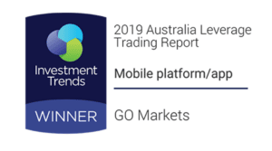


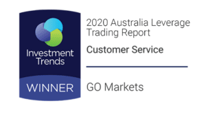


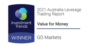


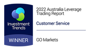


*Awards were awarded to GO Markets group of companies and not exclusively to GO Markets Ltd.
Explore more from GO Markets
CFD markets
Trade CFDs across forex, indices, shares, commodities, metals, ETFs and more.
Platforms & tools
Trading accounts with seamless technology, award-winning client support, and easy access to flexible funding options.
Academy
Learn the skills, strategies, and mindset behind long-term trading success.
Accounts & pricing
Compare account types, view spreads, and choose the option that fits your goals.

Go further with
GO Markets.
Explore thousands of tradable opportunities with institutional-grade tools, seamless execution, and award winning support. Opening an account is quick and easy.
News & insights
Powerful tools for every trading style and preference.


Lorem ipsum dolor sit amet, consectetur adipiscing elit. Suspendisse varius enim in eros elementum tristique. Duis cursus, mi quis viverra ornare, eros dolor interdum nulla, ut commodo diam libero vitae erat. Aenean faucibus nibh et justo cursus id rutrum lorem imperdiet. Nunc ut sem vitae risus tristique posuere.